

Ali Akram
Bring me the problem. I’ll design the answer.
- 01Crumb CatchLogo, packaging, 3D store
- 02NEICMark, site, color system
- 03RaceConLogo, motion, site, brand kit
- 04Iraqi CinemaLogo, brand system, campaigns, site hero
- 05HYGILogo, bilingual identity, brand guide
- 06Cogent ConnectionsRebrand, guidelines, logo motion
- 07BizarreIdentity, packaging, social
- 08The TripIdentity, print
- 09Amaterasu3D, lighting, animation
- 10Ahmed Al‑KiremliPersonal brand, guidelines, stationery
Crumb Catch
The store. The product is built in 3D and moves with the scroll, kitchen to workshop.
The mark, live. It draws itself, then the U drops onto the R and the whole mark takes the hit.
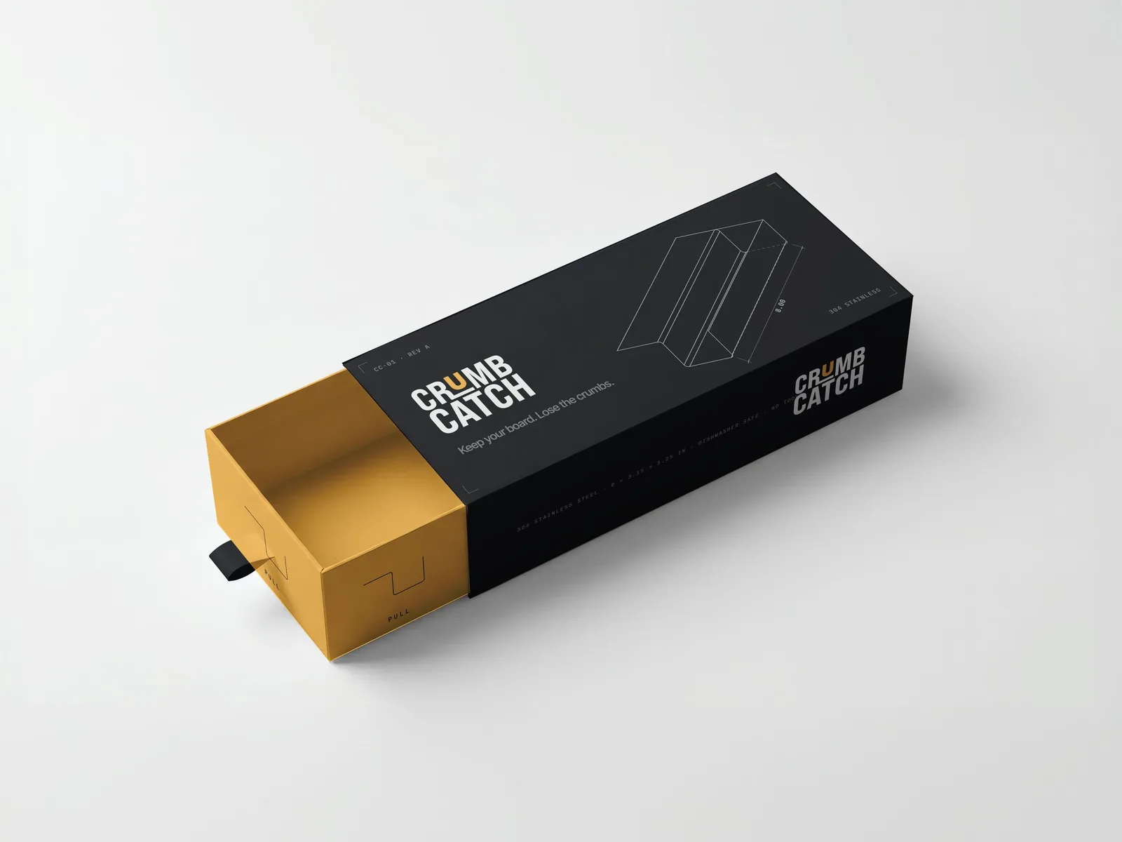
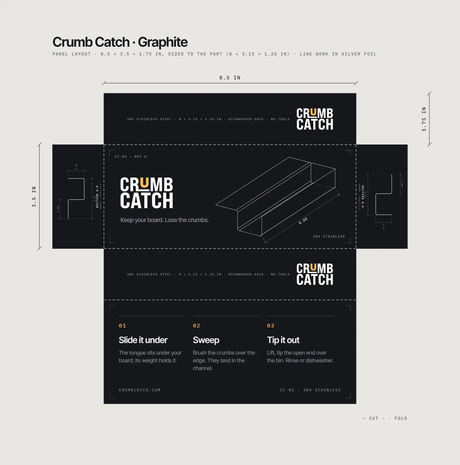
Packaging. A graphite sleeve over an amber drawer, printed with the fold of the part itself.
NEIC
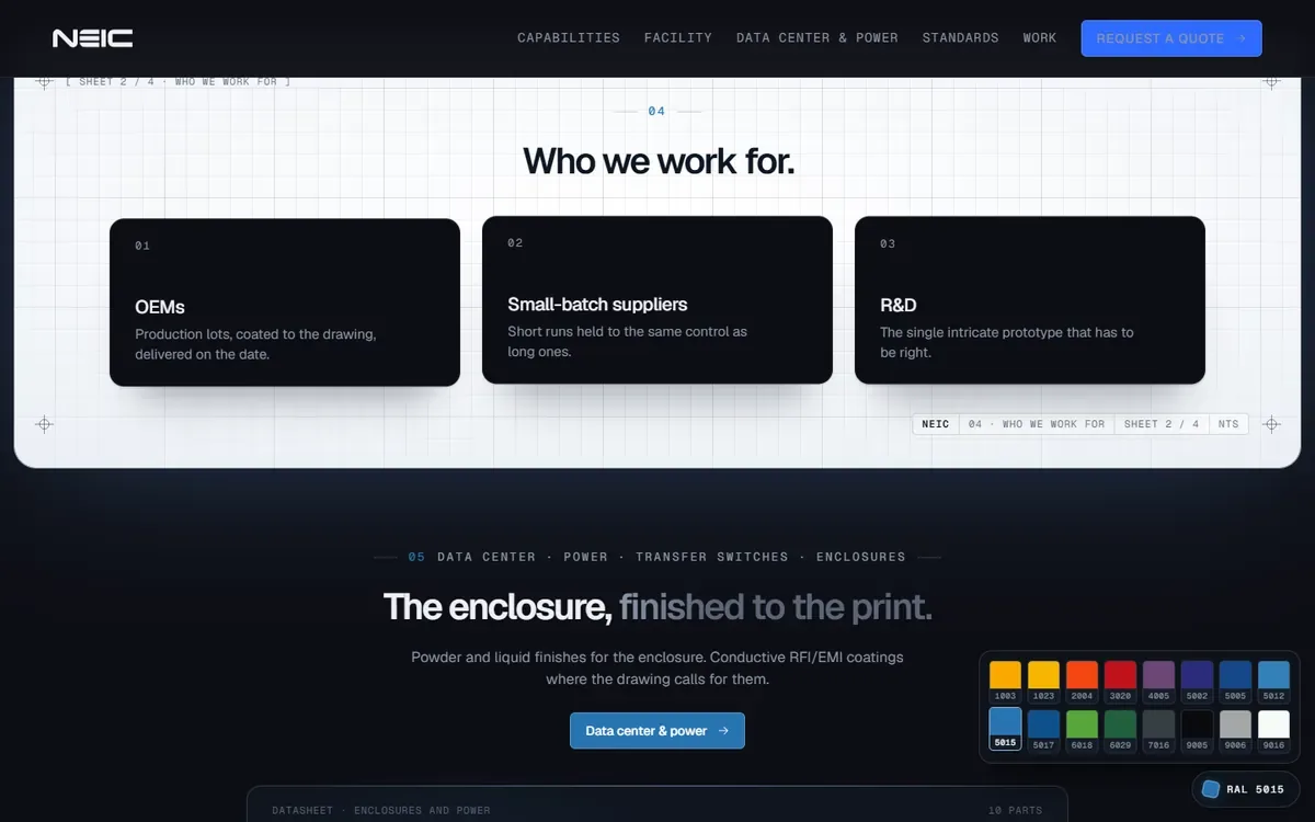
The hero. The mark is sprayed on pass by pass as you scroll, then cured.
Tap a strip
The RAL fan deck, as the site’s color picker.
RAL 5015 Sky blue
Pick a coat and it sprays across the page, like the parts on the line.
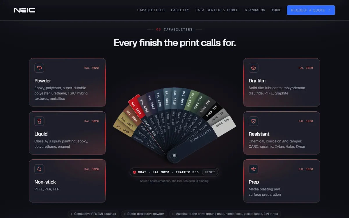
Fan deck
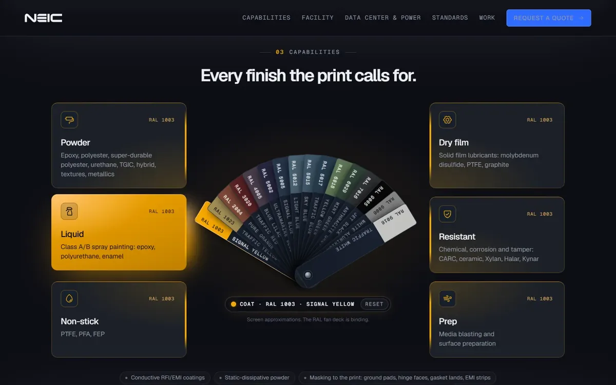
Bold color
Floating deck
RaceCon
The logo, live. Three colors race for one slot, one locks in. Pick the winner.

Horizontal
Stacked

Plate

Tall plate

Split plate

Wordmark
The site. A console that runs the room: stations light up, orders land, the timer counts.
Lights out. Logo motion study
Double booked. Logo motion study
Match cut. Logo motion study
Every feature, one screen each. Big numbers, the brand colors as zones.
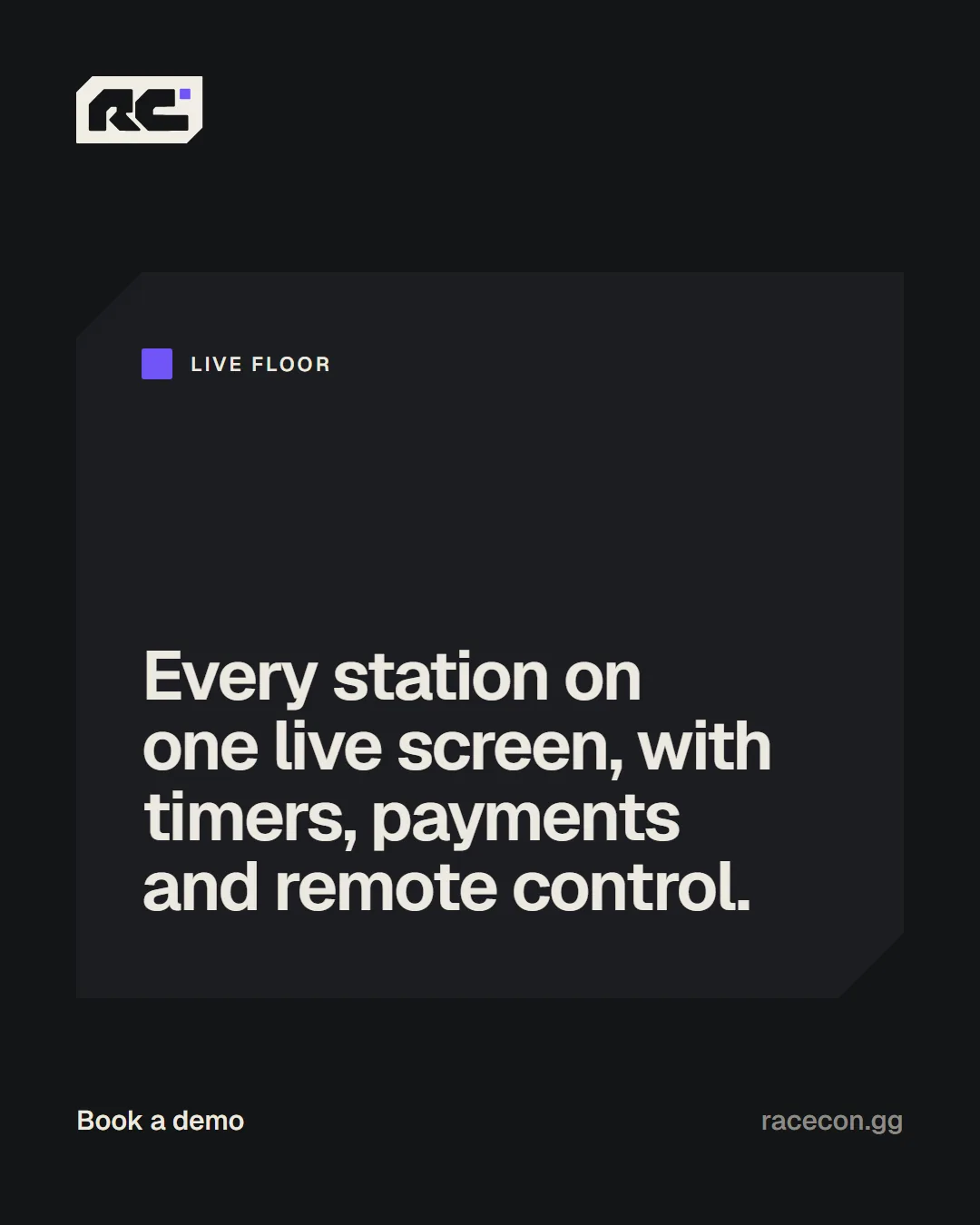
Social kit. Templates for every post.
Iraqi Cinema
The site. The lights go down, the button throws the projector’s beam across the films.
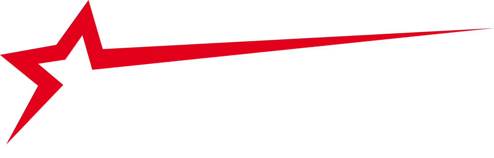
The star. One star, two scripts. Its tail pulls the name forward like a beam across a dark hall.
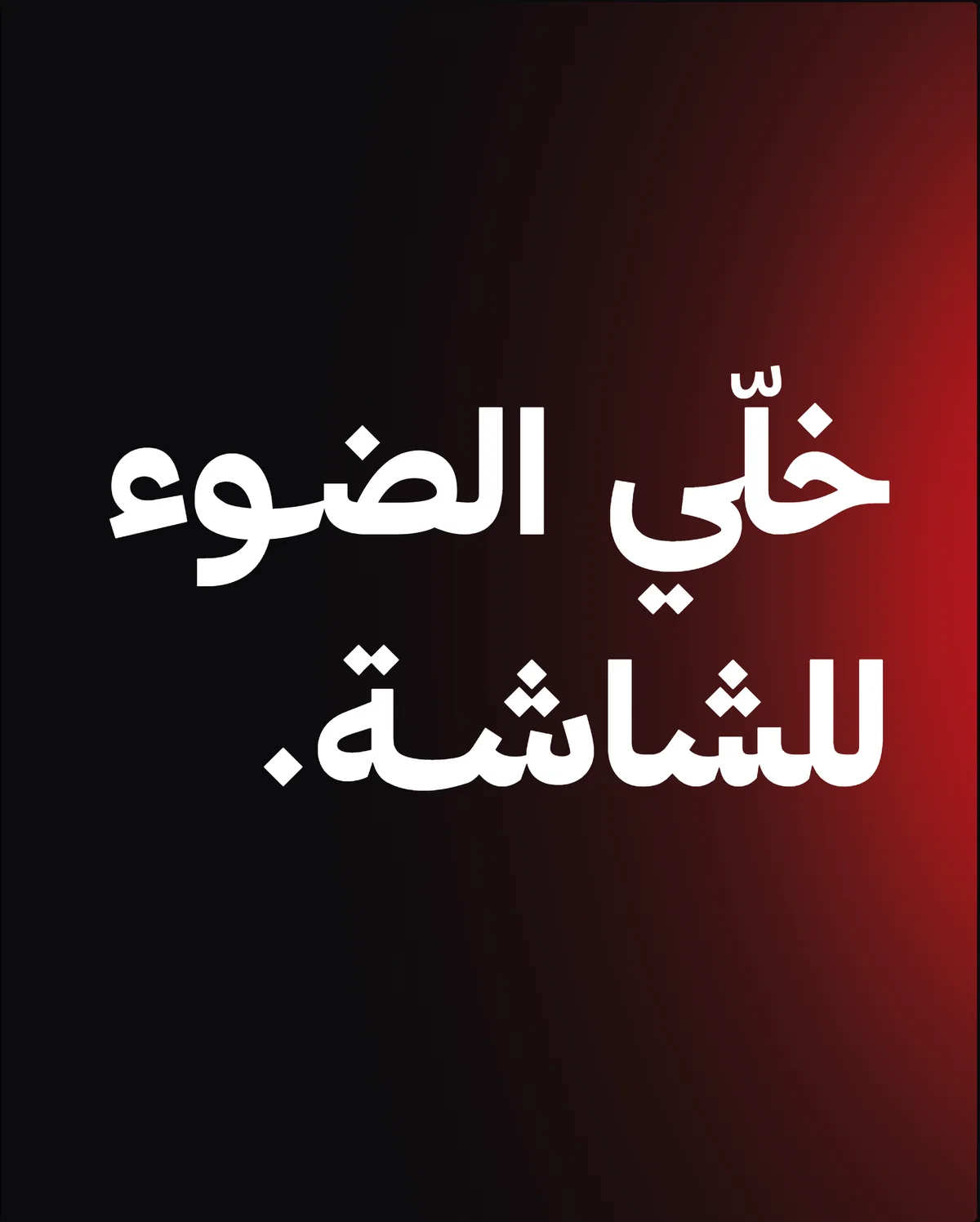
One light, everywhere.
Posts, halls, screens, seats and tickets all lit the same way, in Iraqi Arabic.
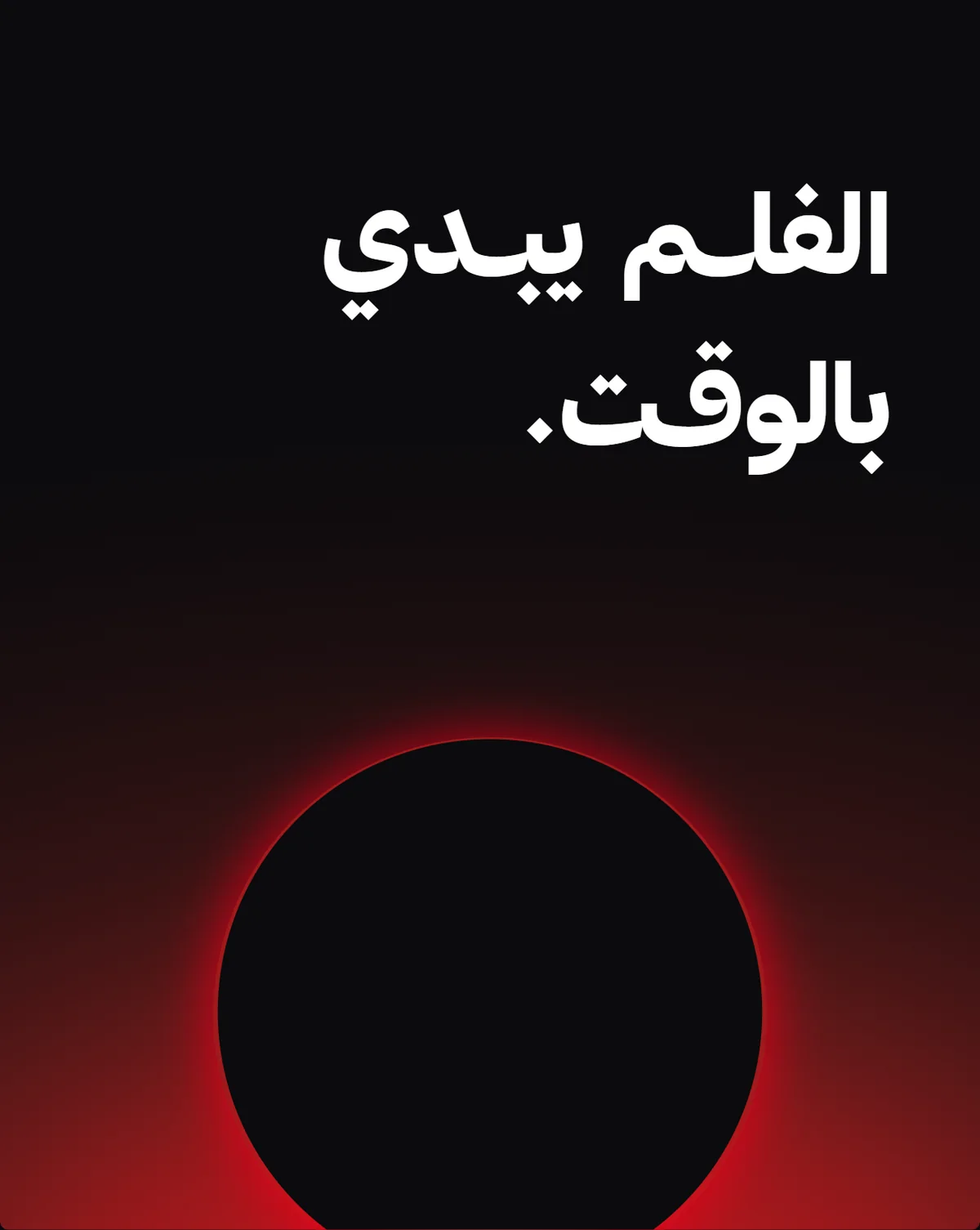
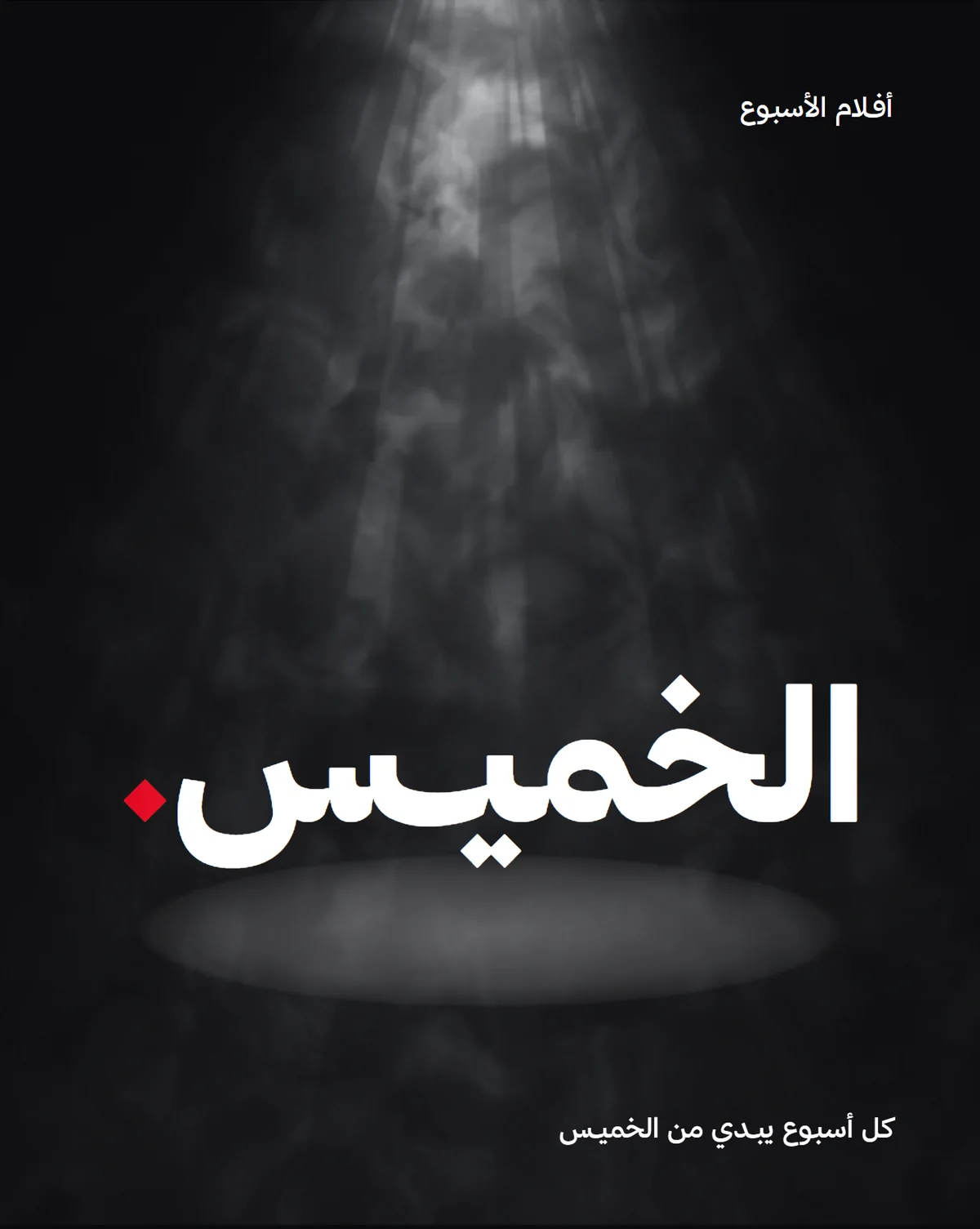
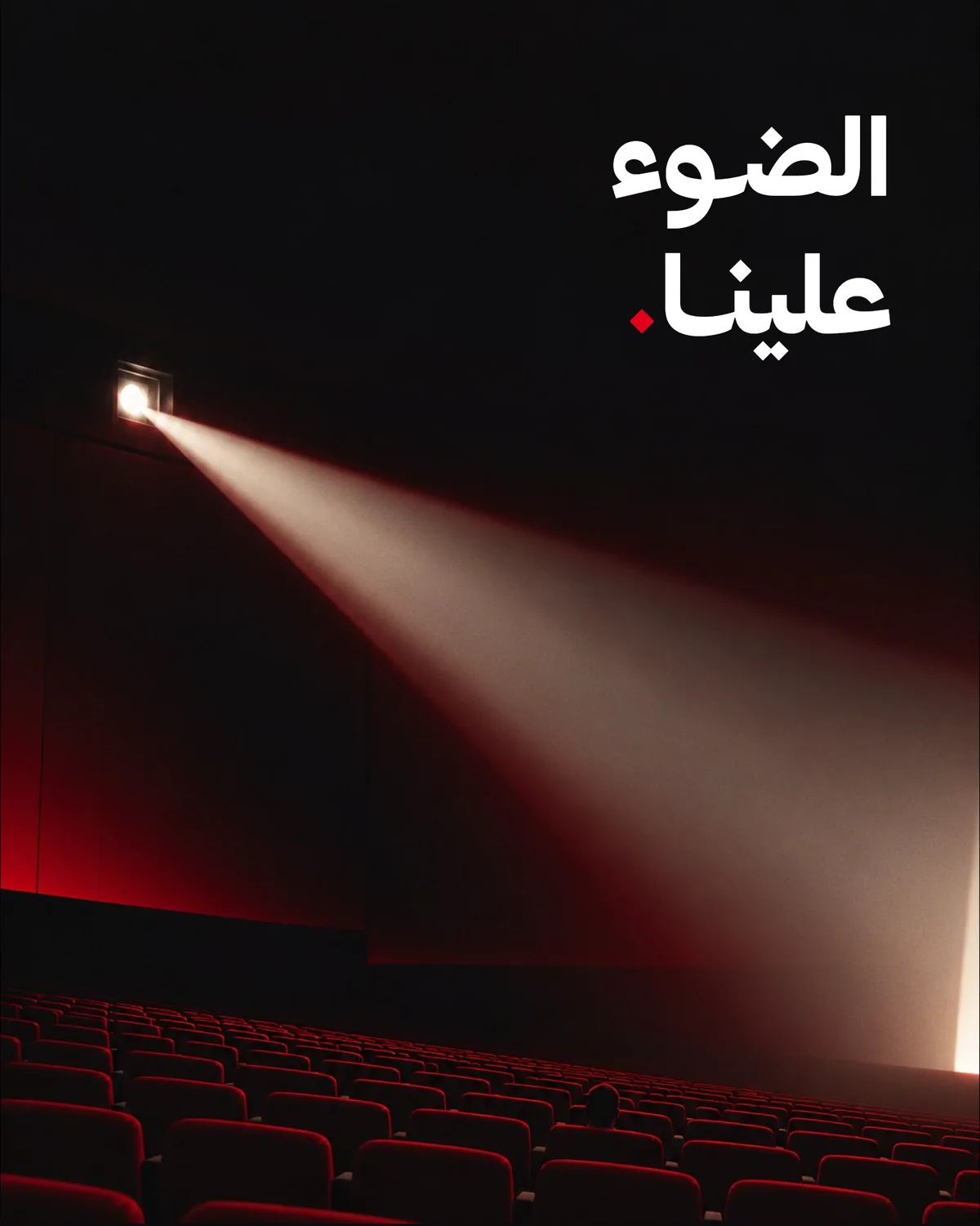
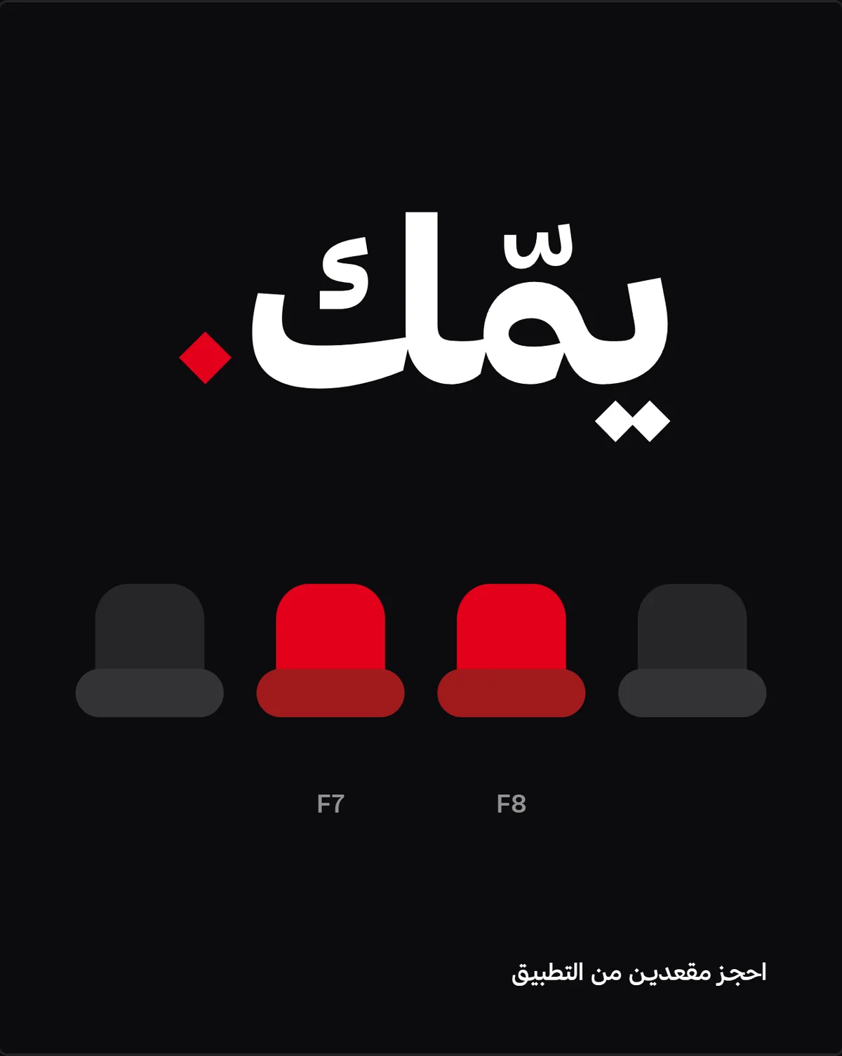
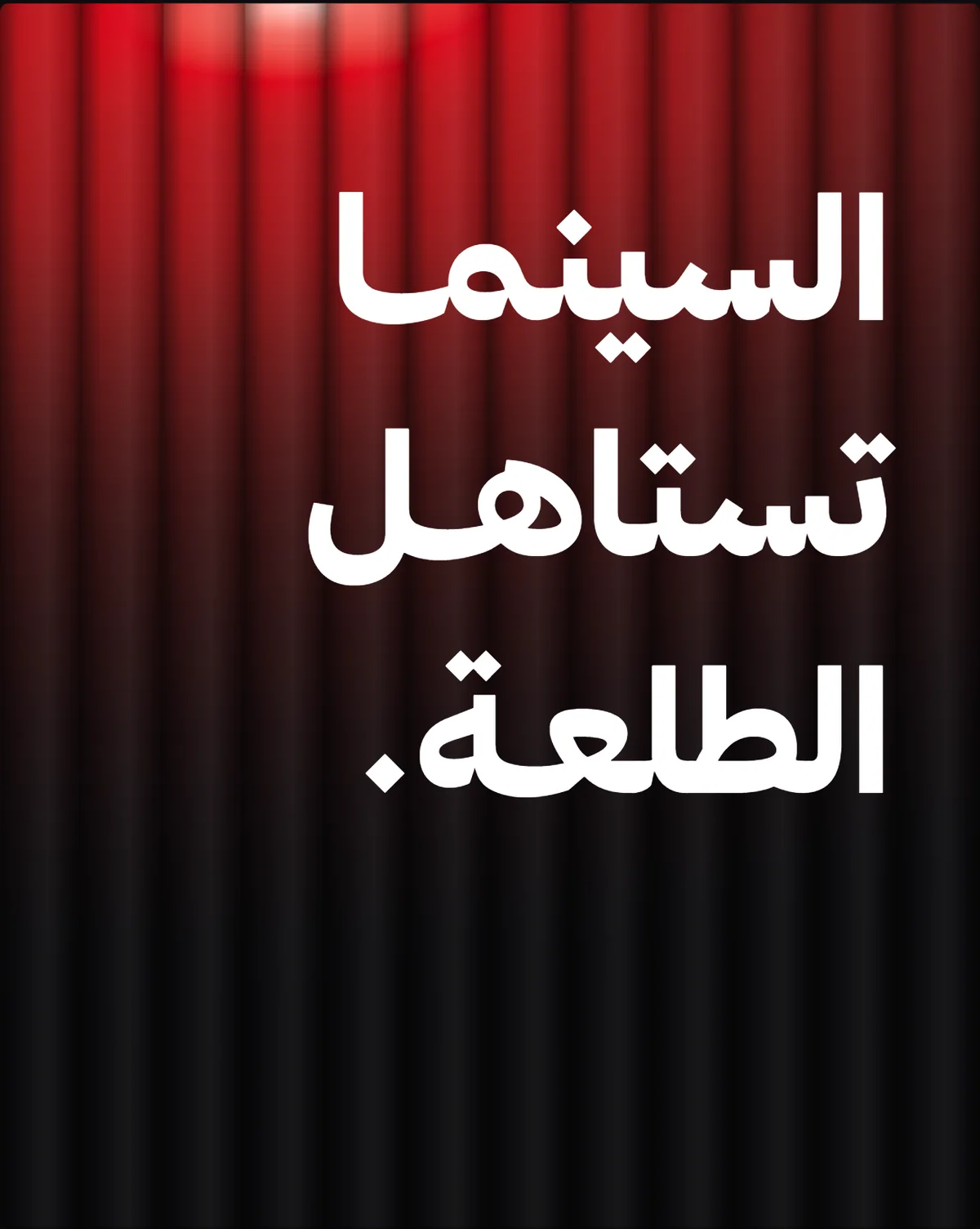
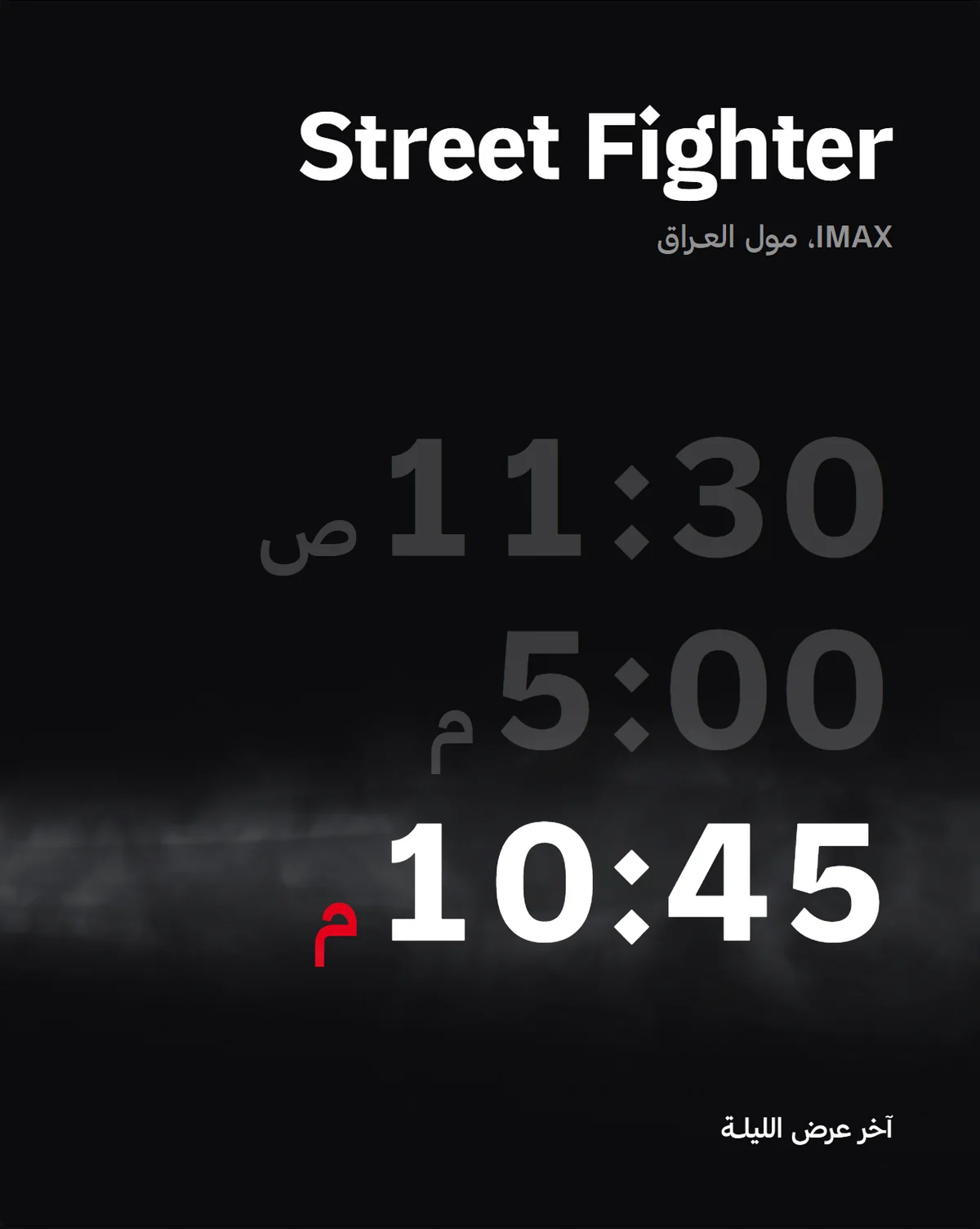
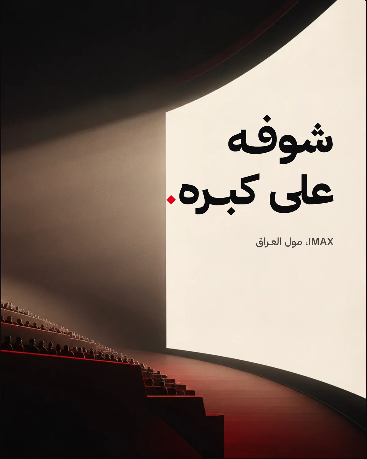
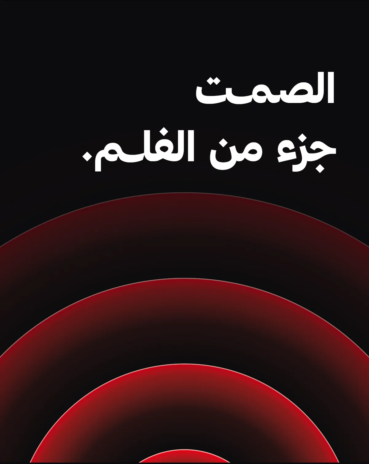
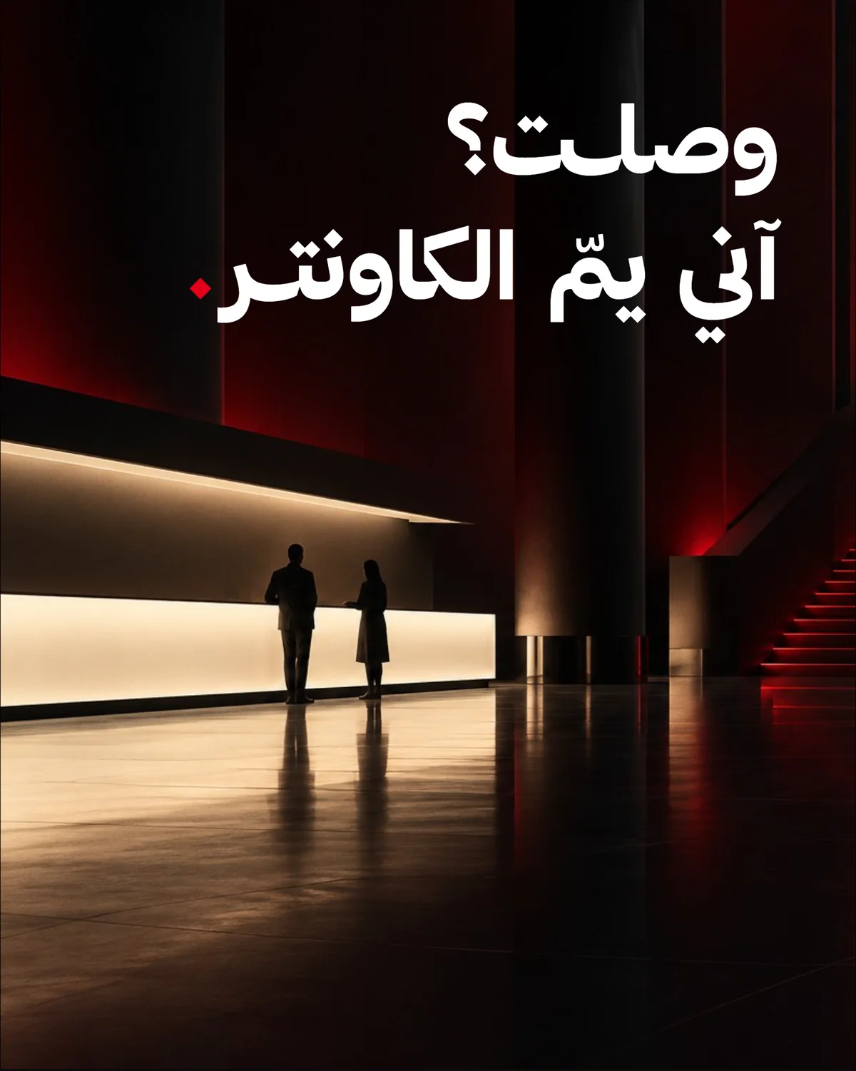
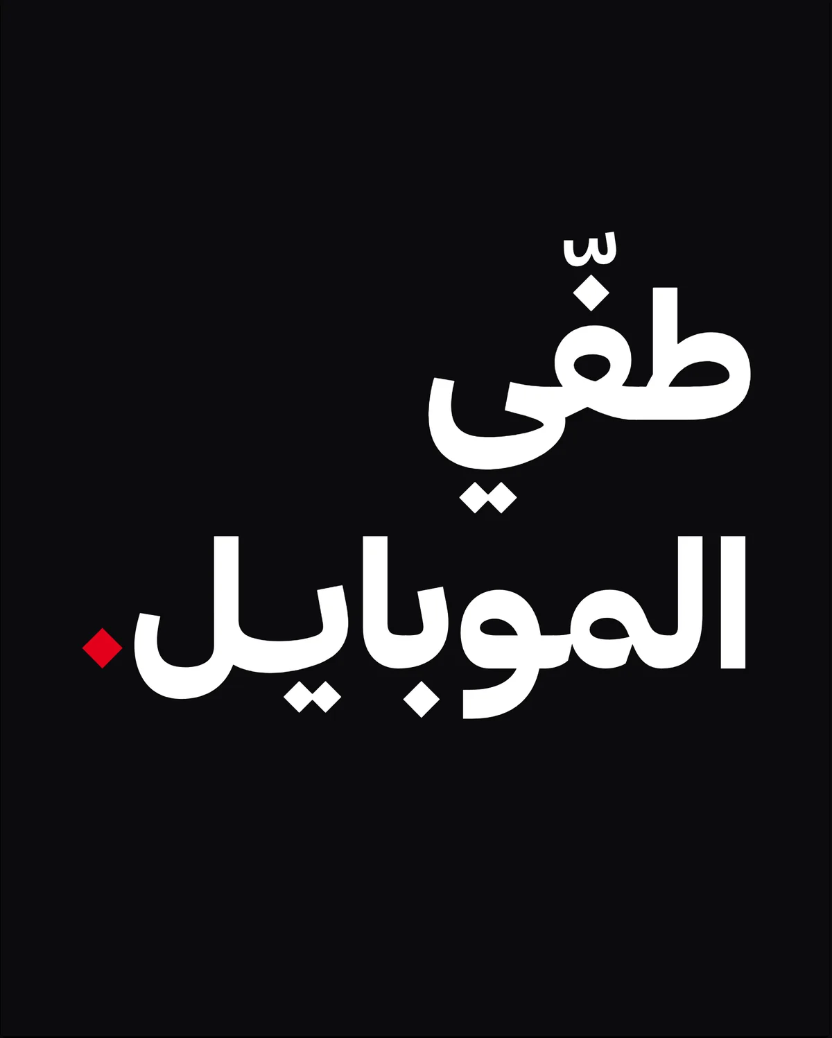
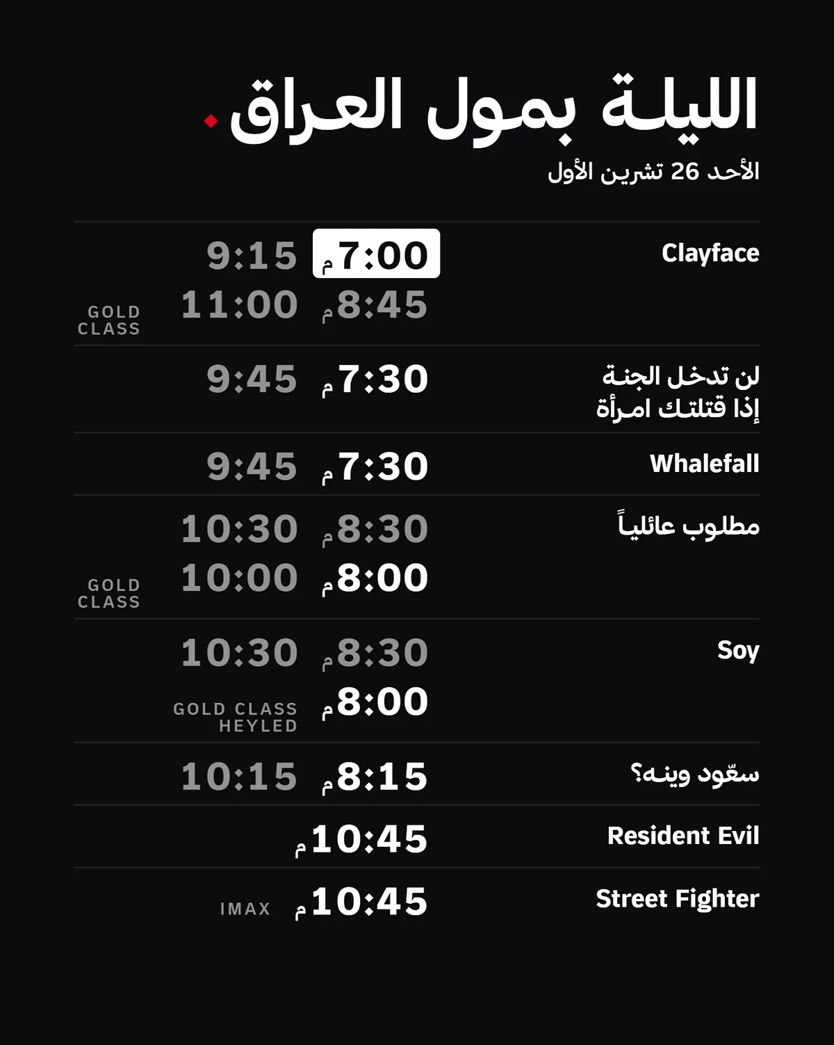
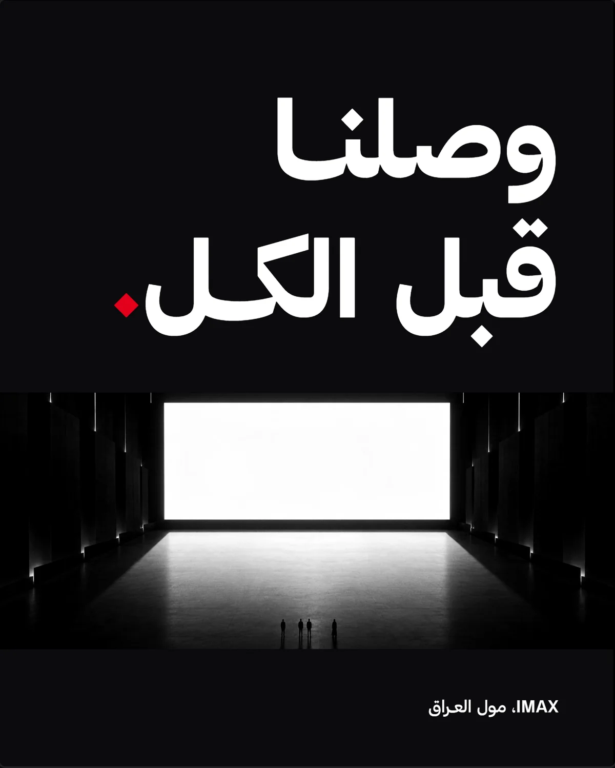
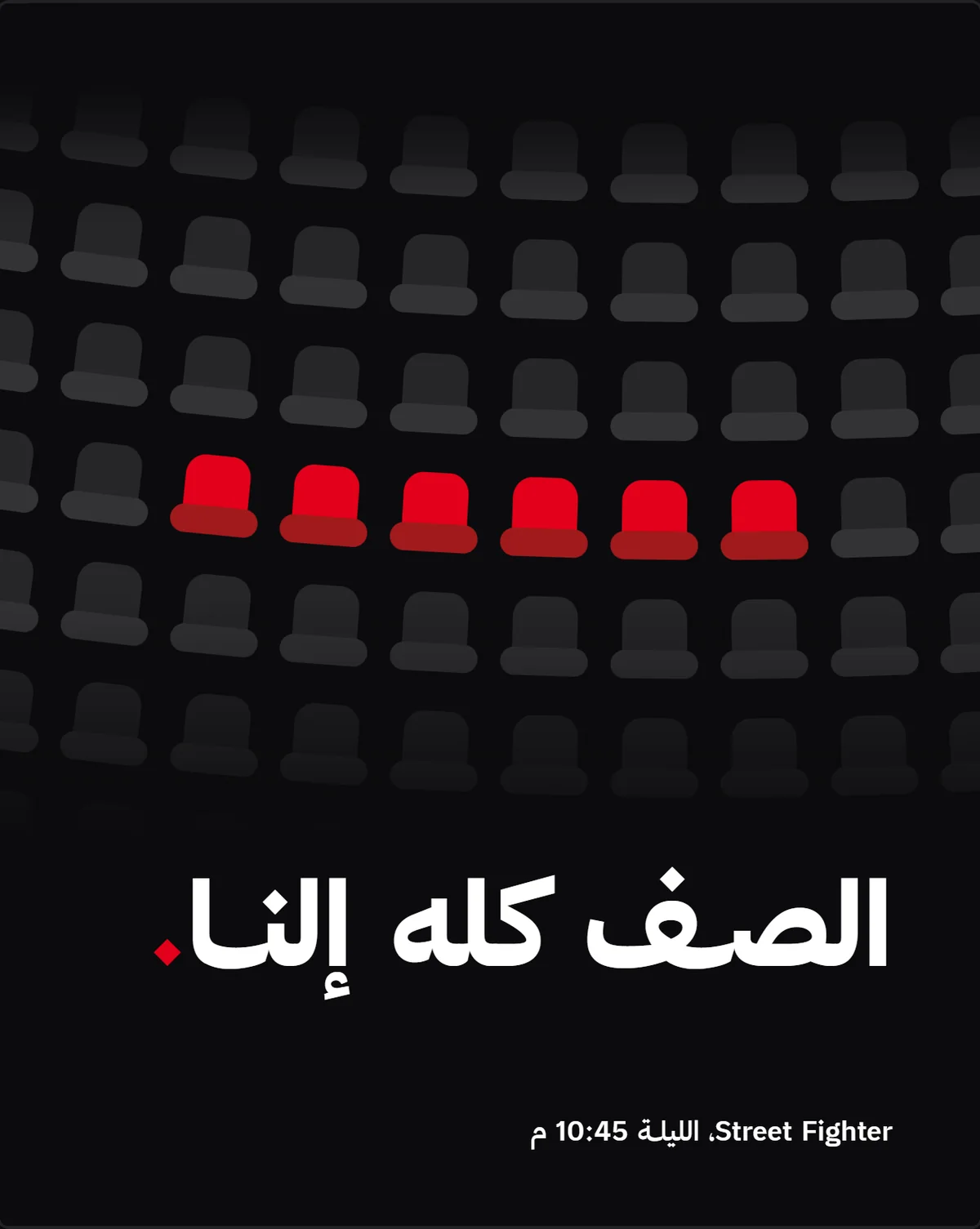

Showtimes wall. Every film of the night on one lobby screen.
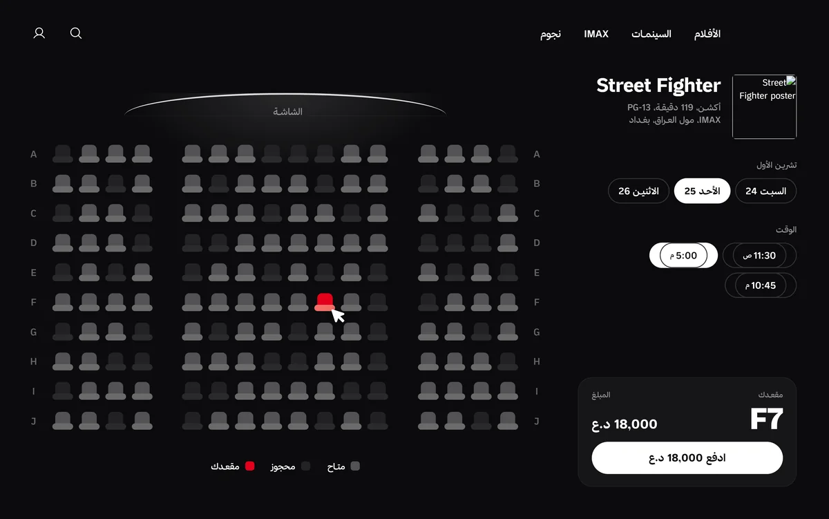
Seat picker. Your seat lights up red, the screen glows above.
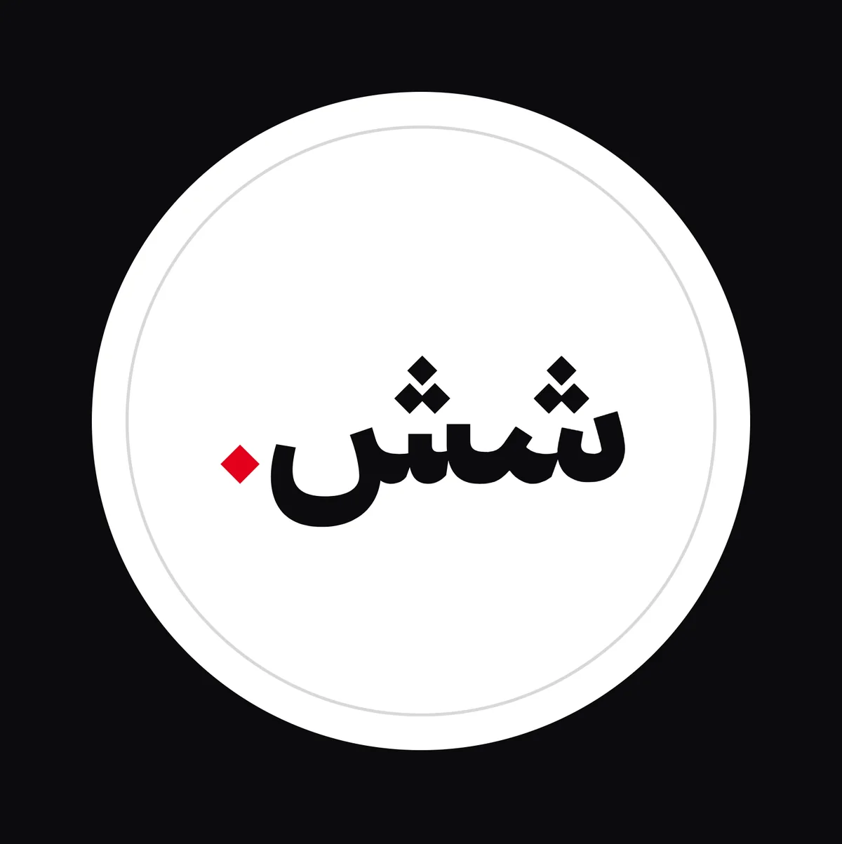
Popcorn. The lid says shh.
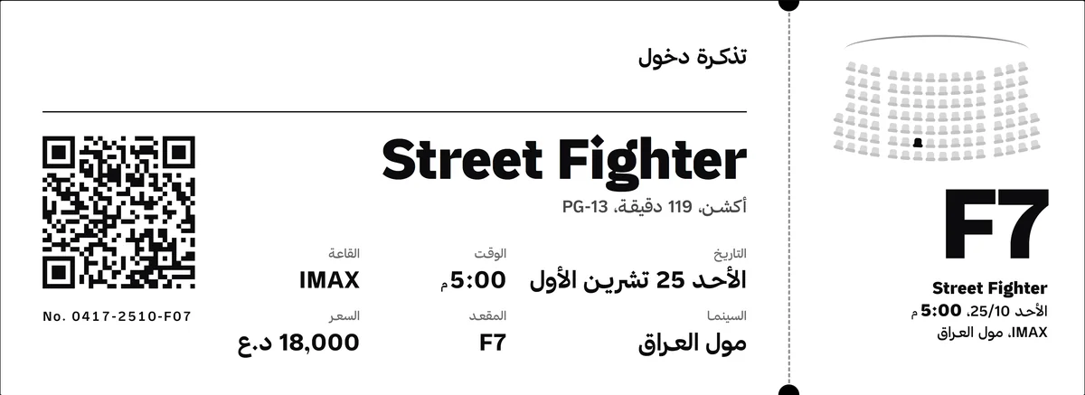
Ticket. Thermal print, the seat map on the stub.
HYGI
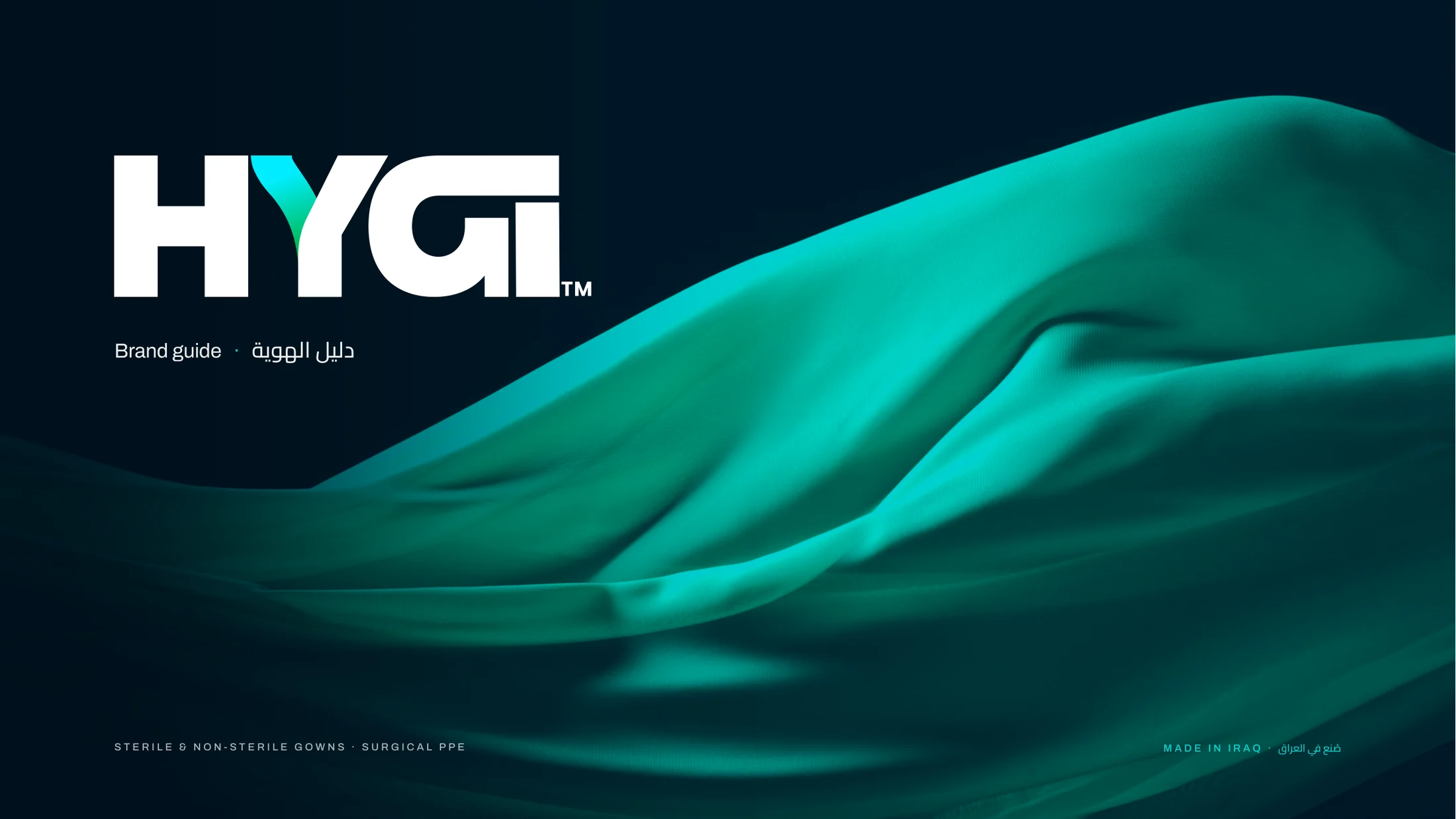
The guide. Fourteen pages, every one in English and Arabic.
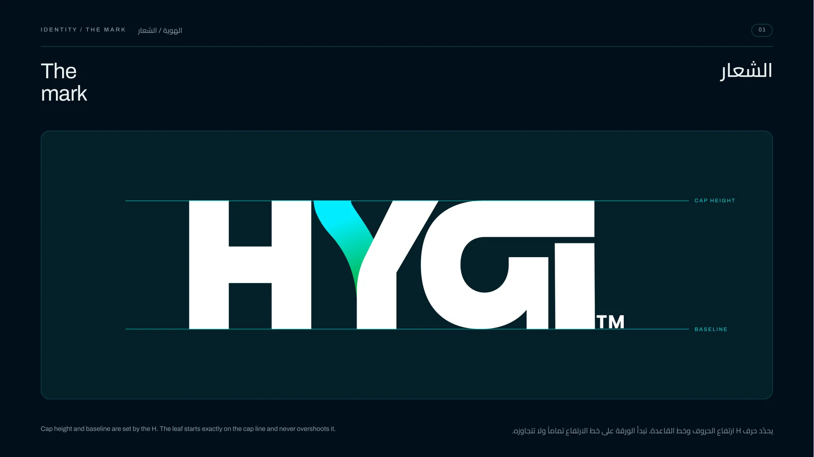
The mark. Heavy, wide letters that still read small on a label.
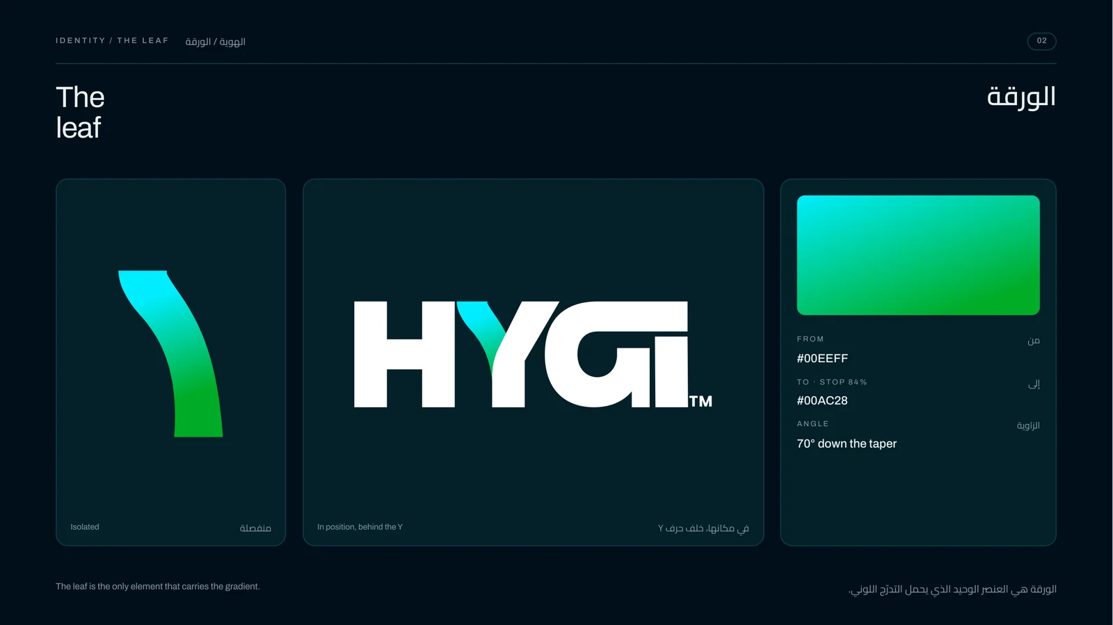
The leaf. The only color in the mark, grown out of the Y.
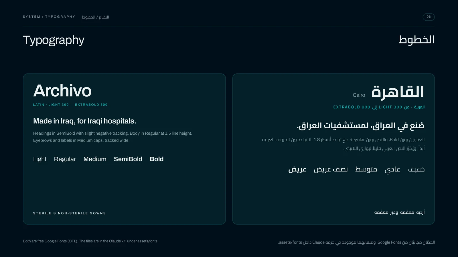
Two scripts. Archivo and Cairo, side by side on every page.
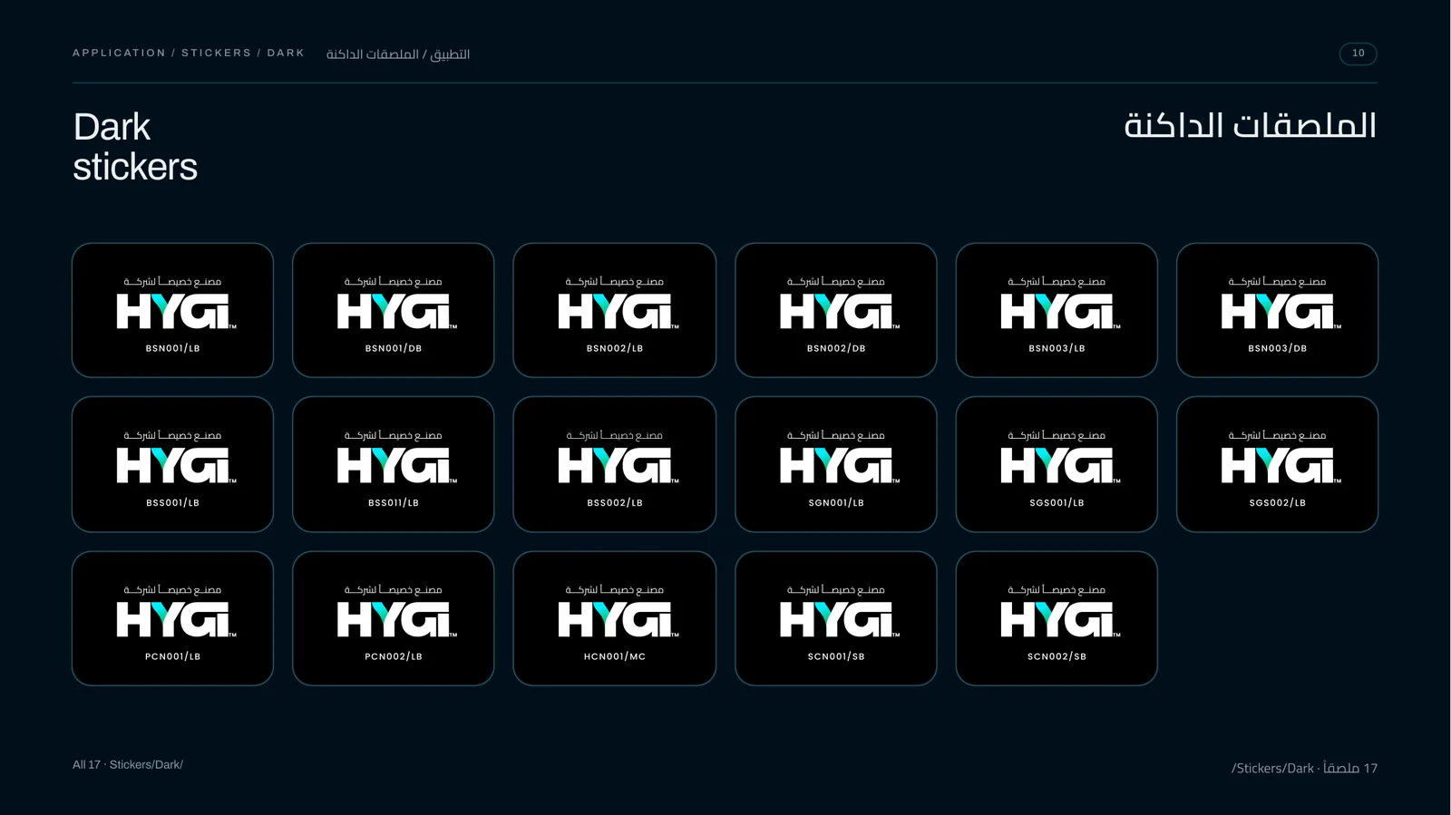
Stickers. One for every product code, light and dark.
Cogent Connections
The mark, moving. The wordmark builds stroke by stroke, the N and T cut into one.
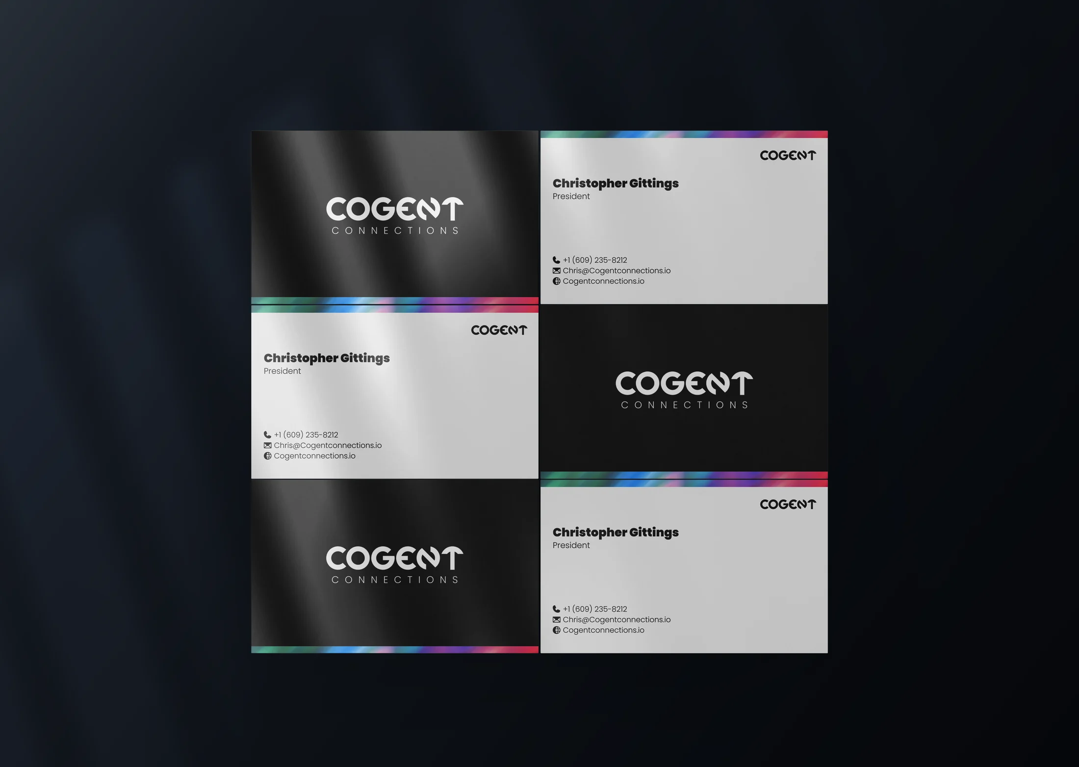
Cards. Black, white, and the streak along one edge.
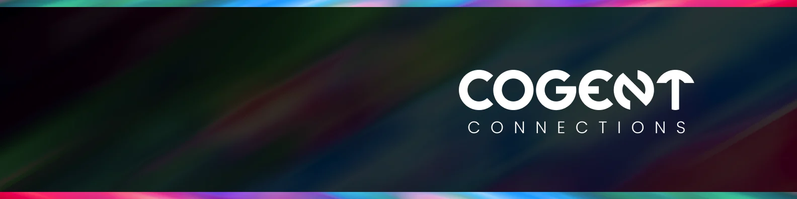
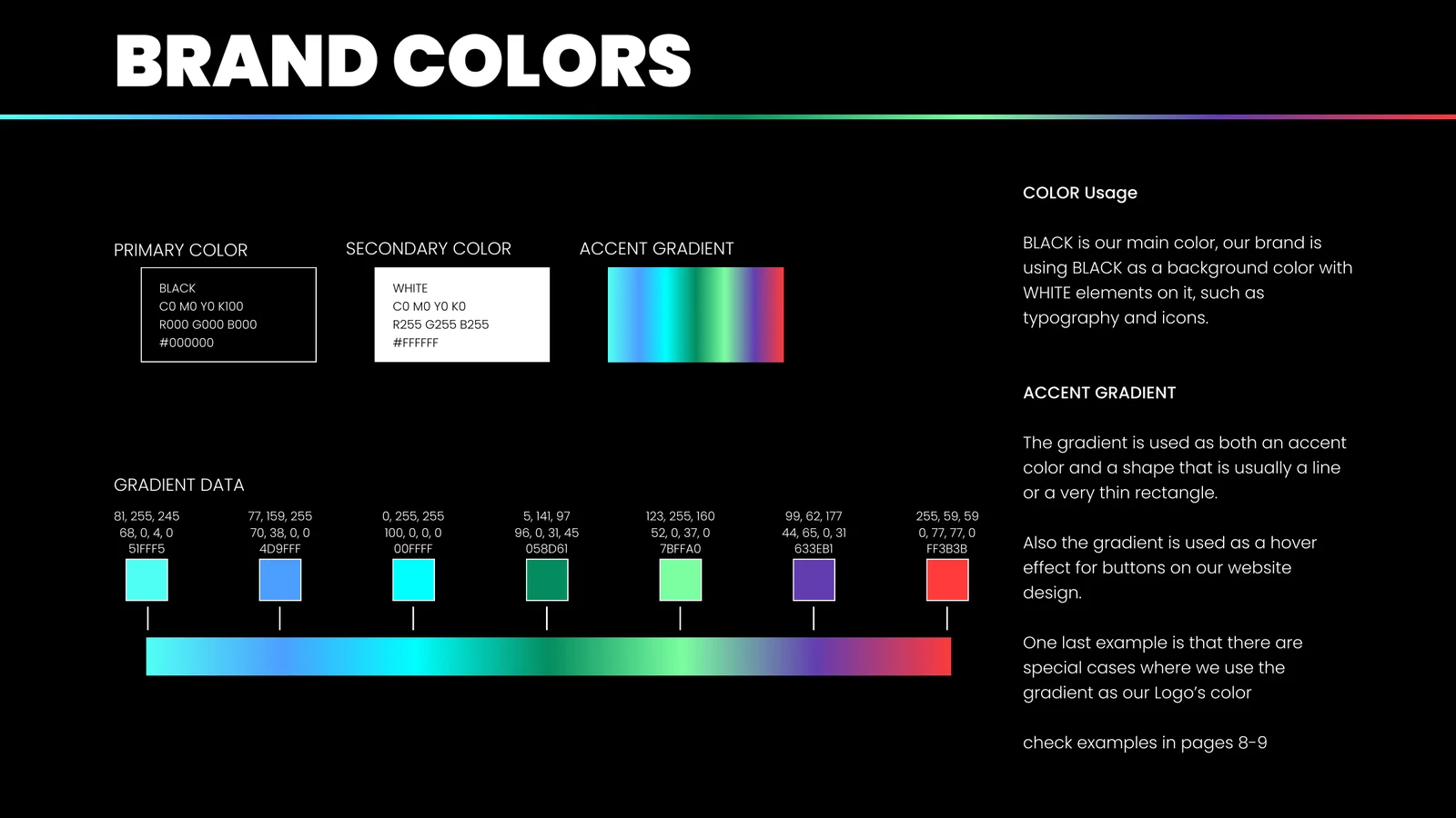
The system. Black first, the gradient only as a line or a light.
Bizarre
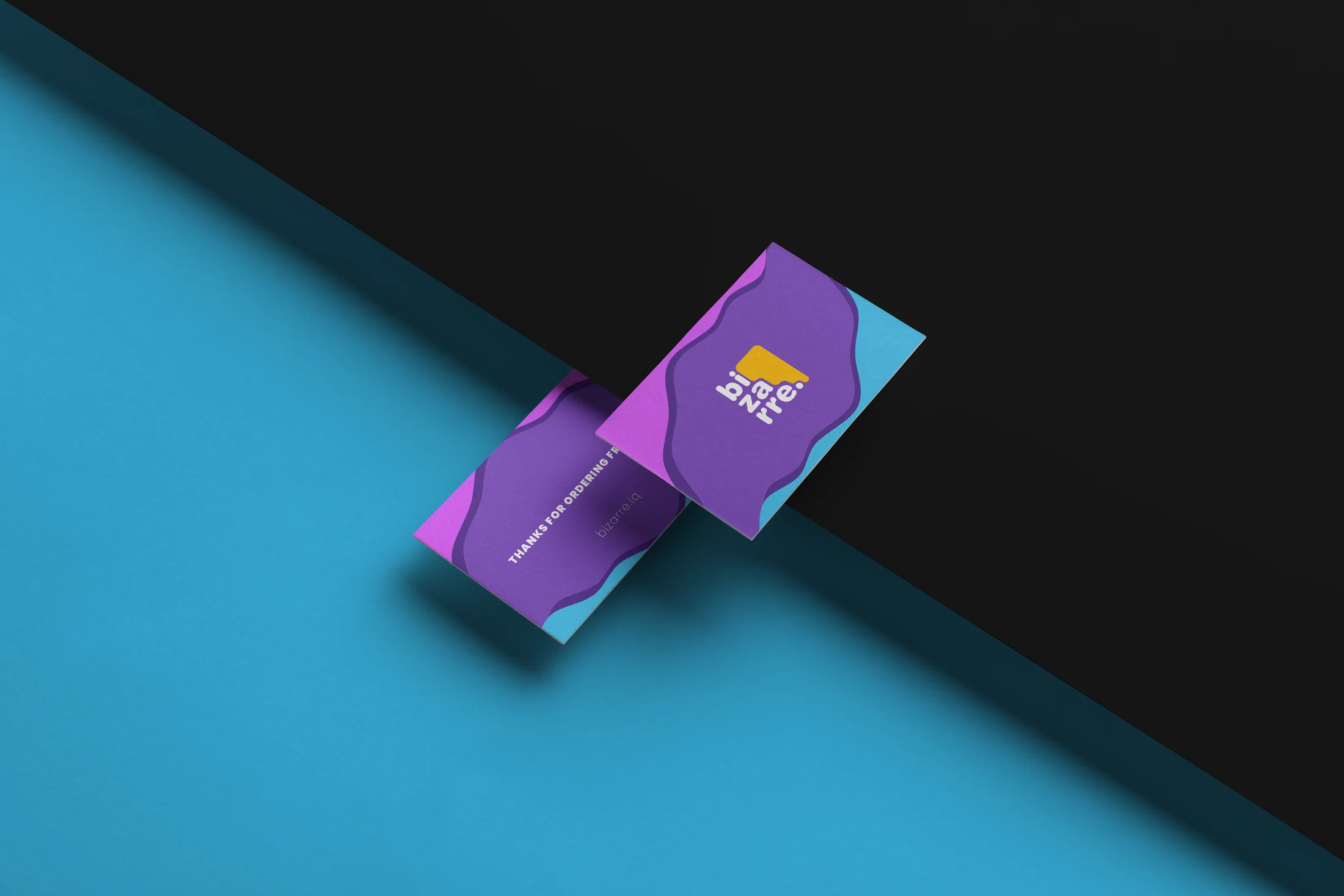
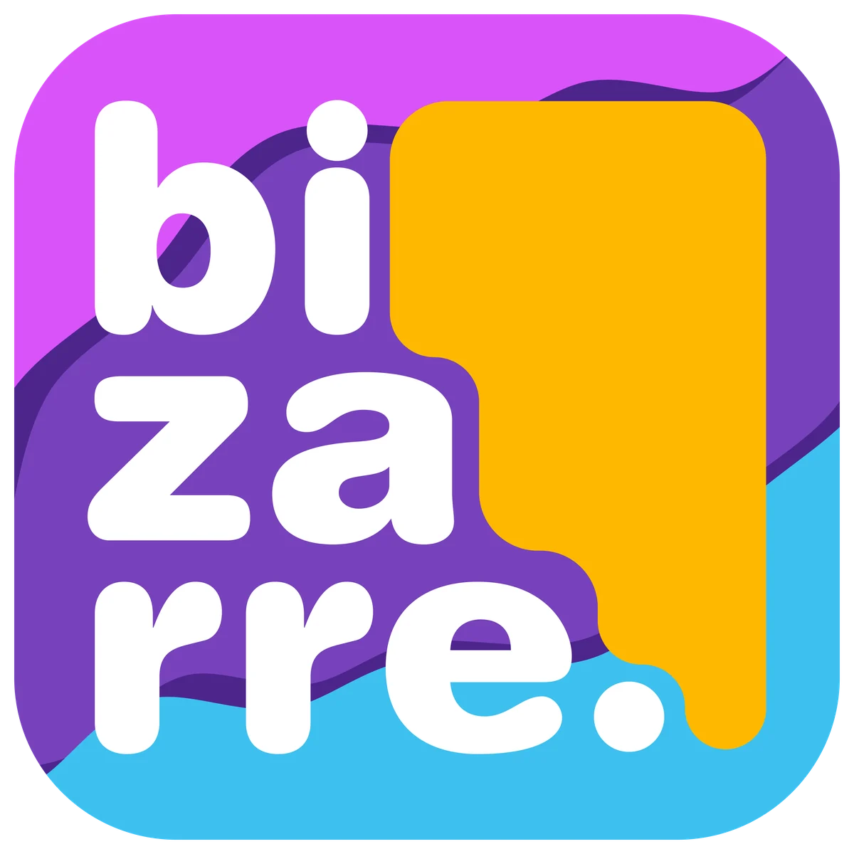
The mark. Three stacked syllables and a lump of yellow clay holding them up.
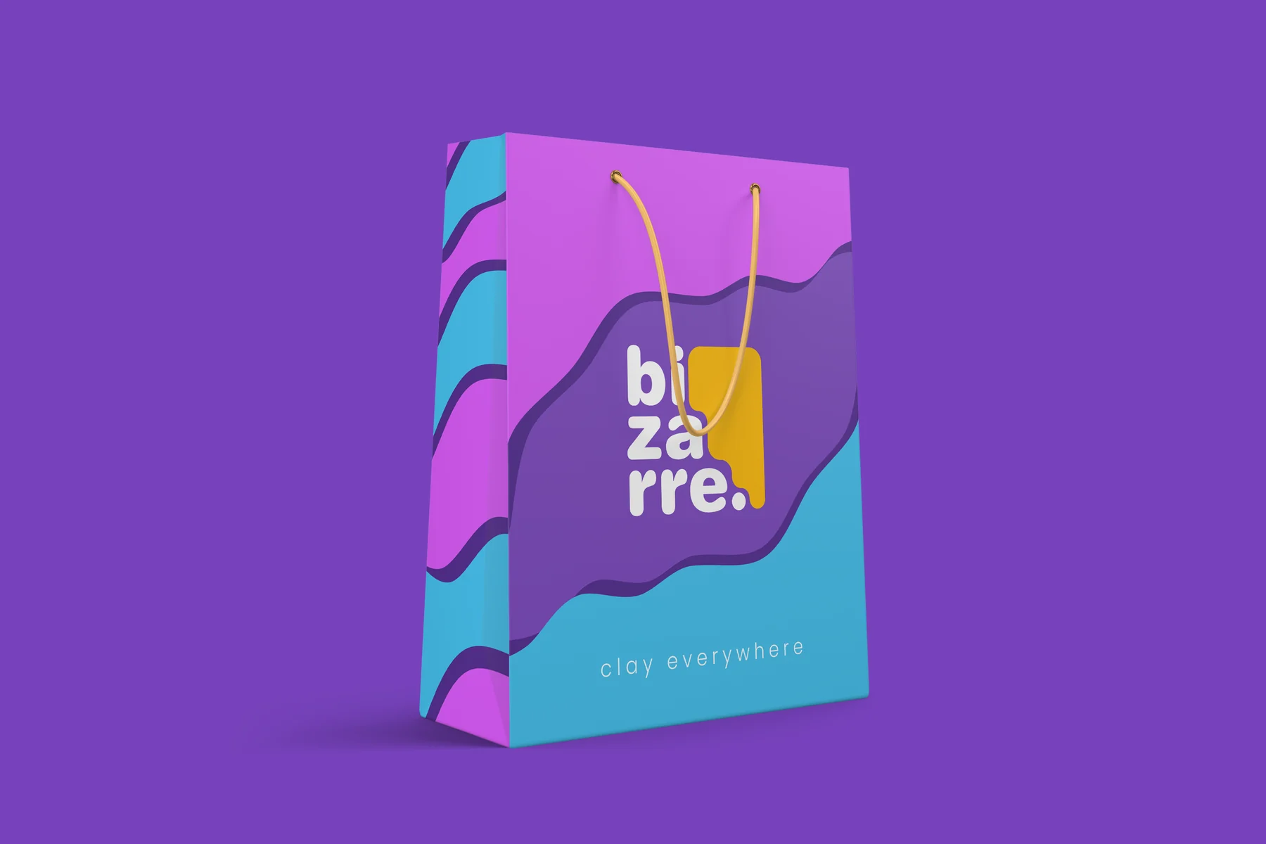
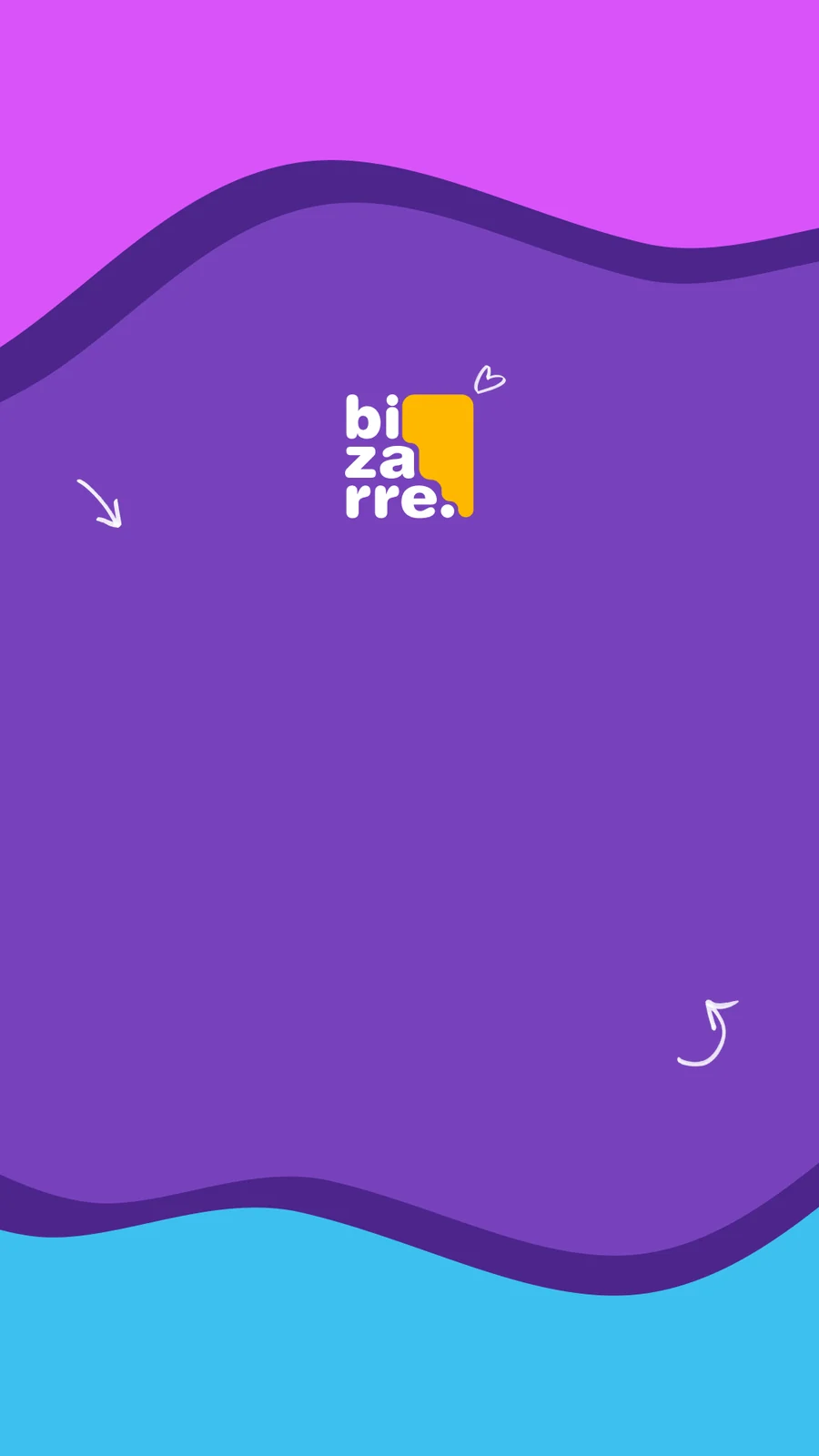
Bag and stories. The waves wrap every surface like rolled clay.
The Trip
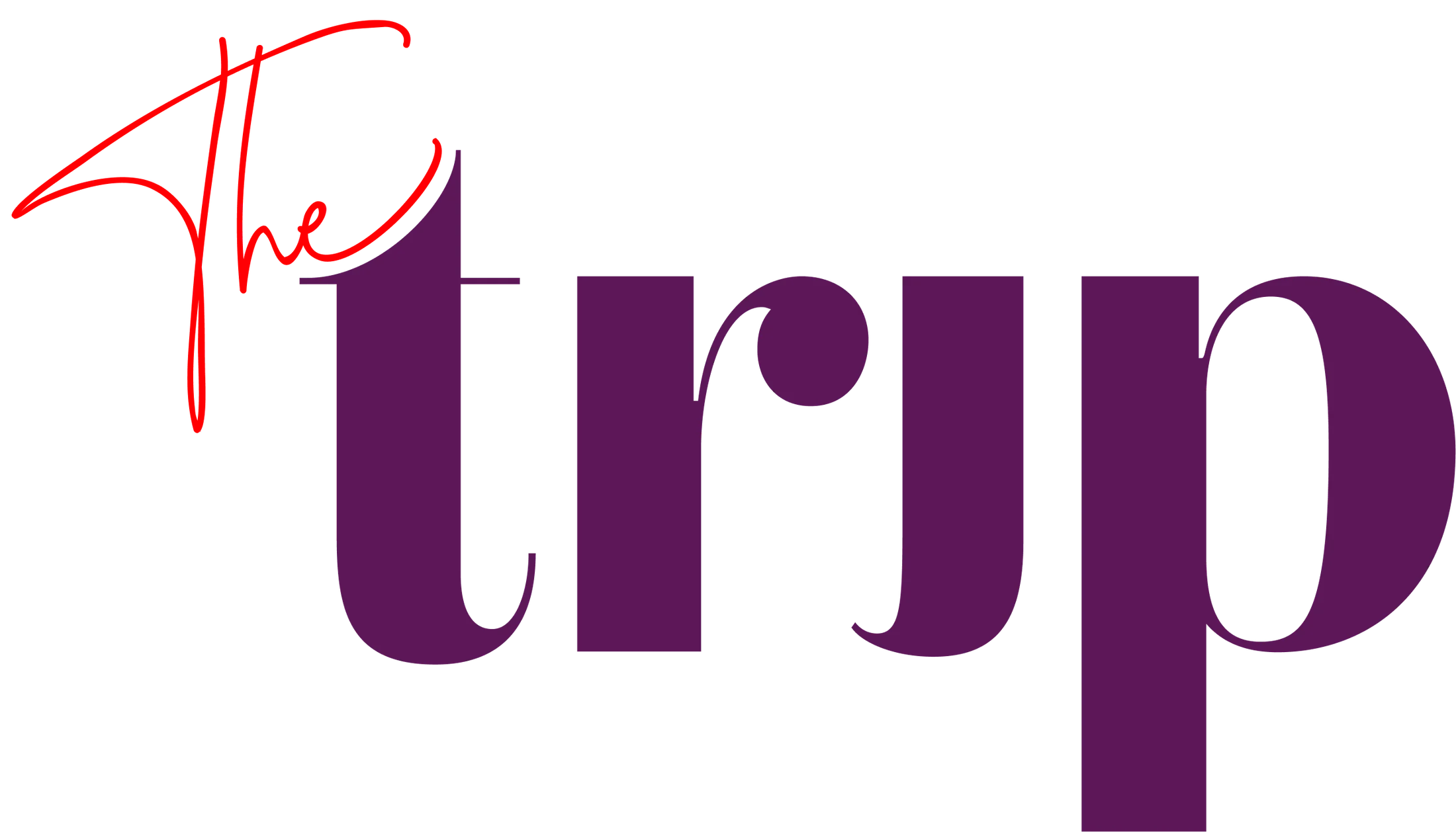
The wordmark. A hand-written “The” riding a serif, the i turned upside down.
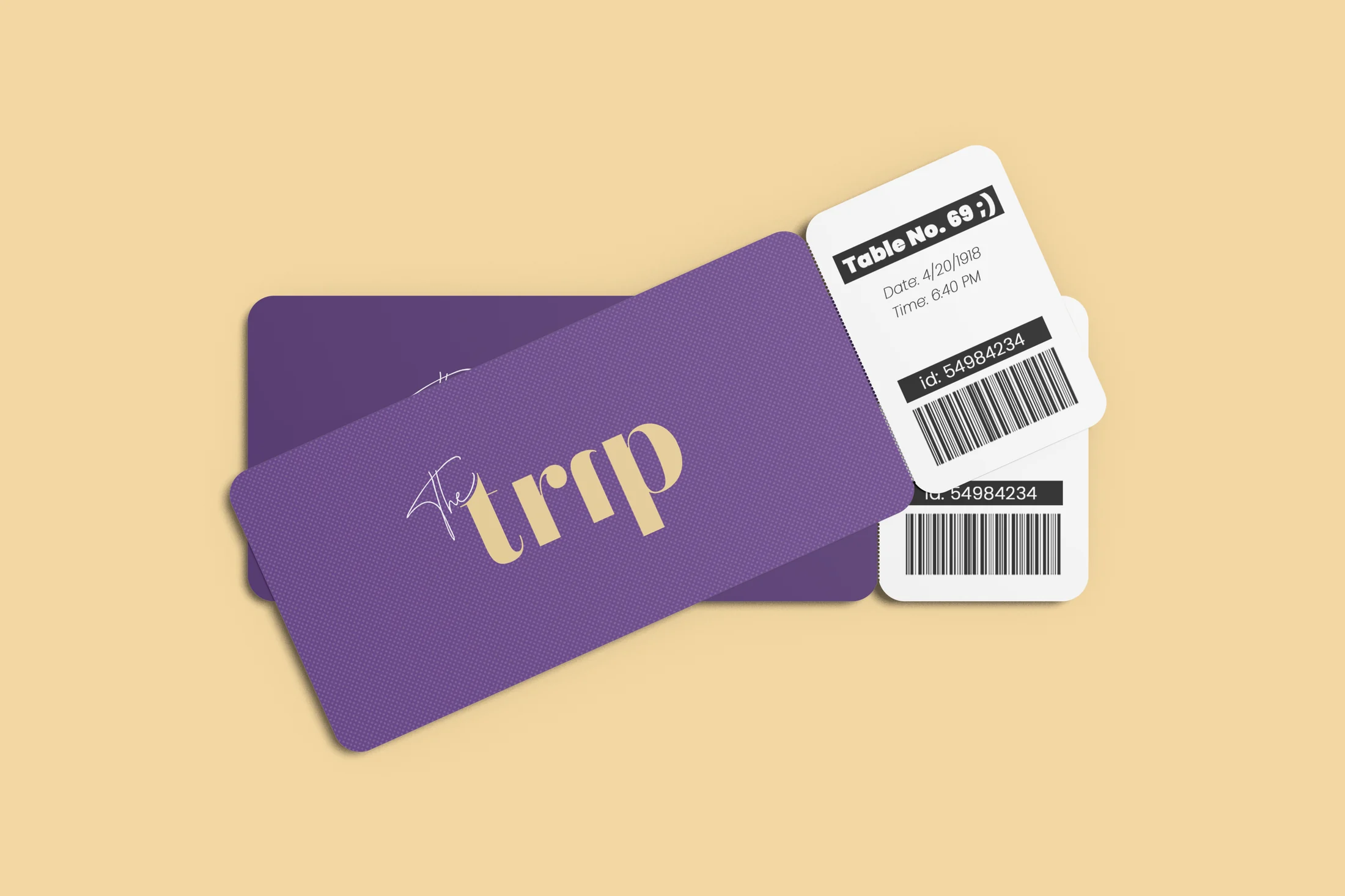
Table tickets. Your order travels with you, like a boarding pass.
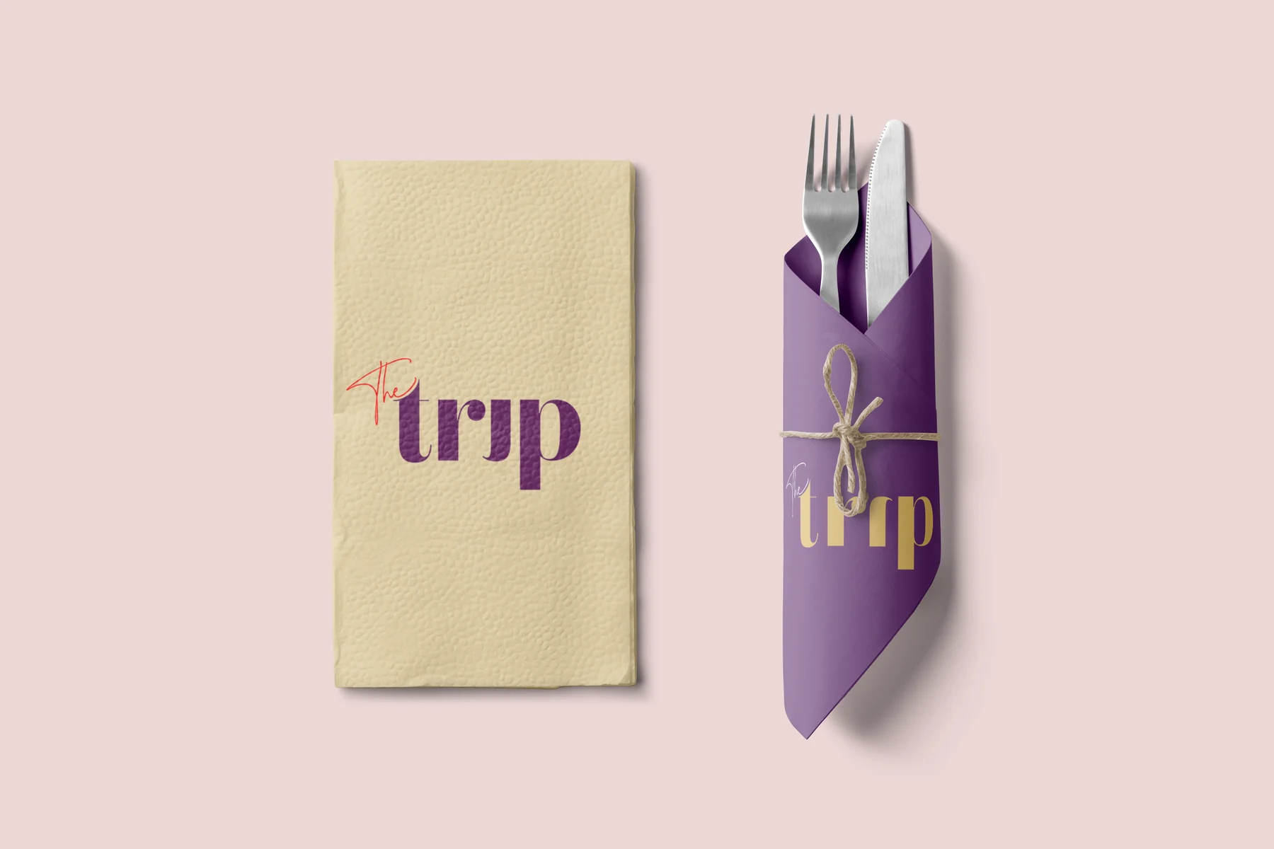
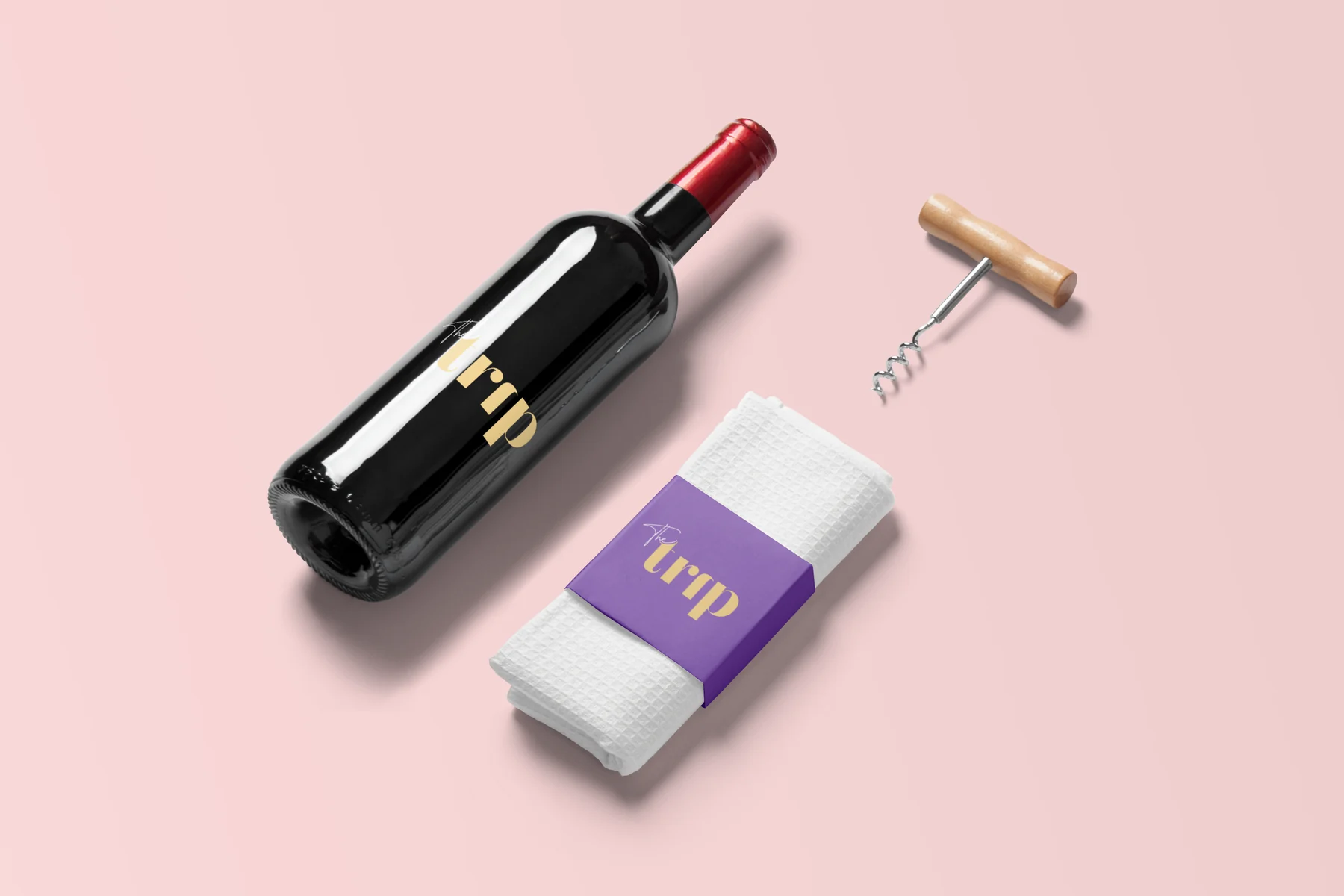
Amaterasu
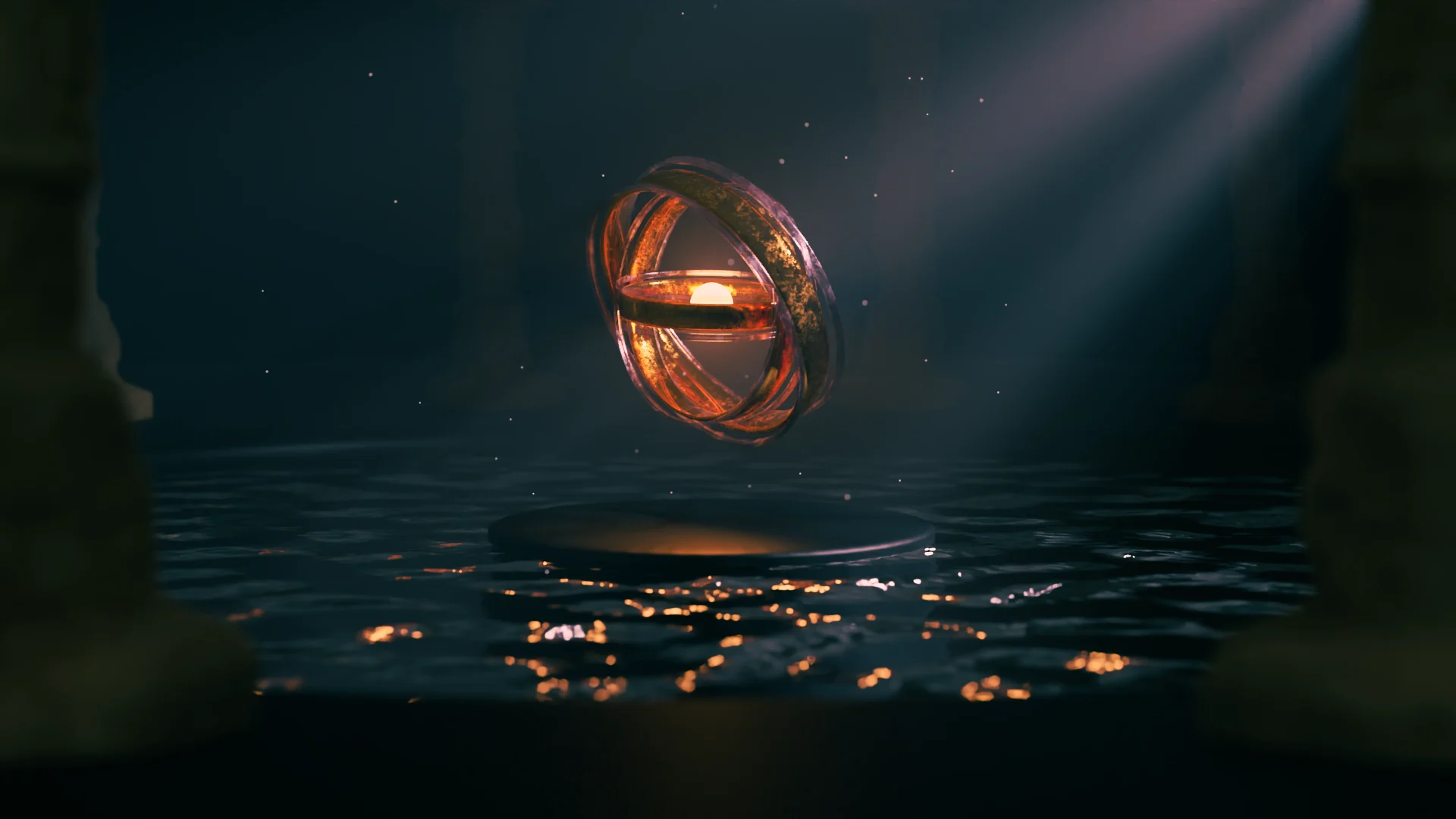
The temple. Fog, water and one warm light. Everything else stays in the dark.
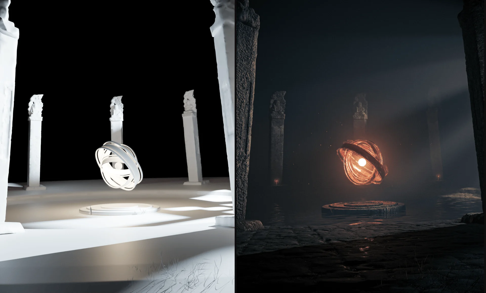
Clay to final. The same frame before and after light and materials.
Where it started. The orb was a loop on its own two years before the temple.
Ahmed Al‑Kiremli
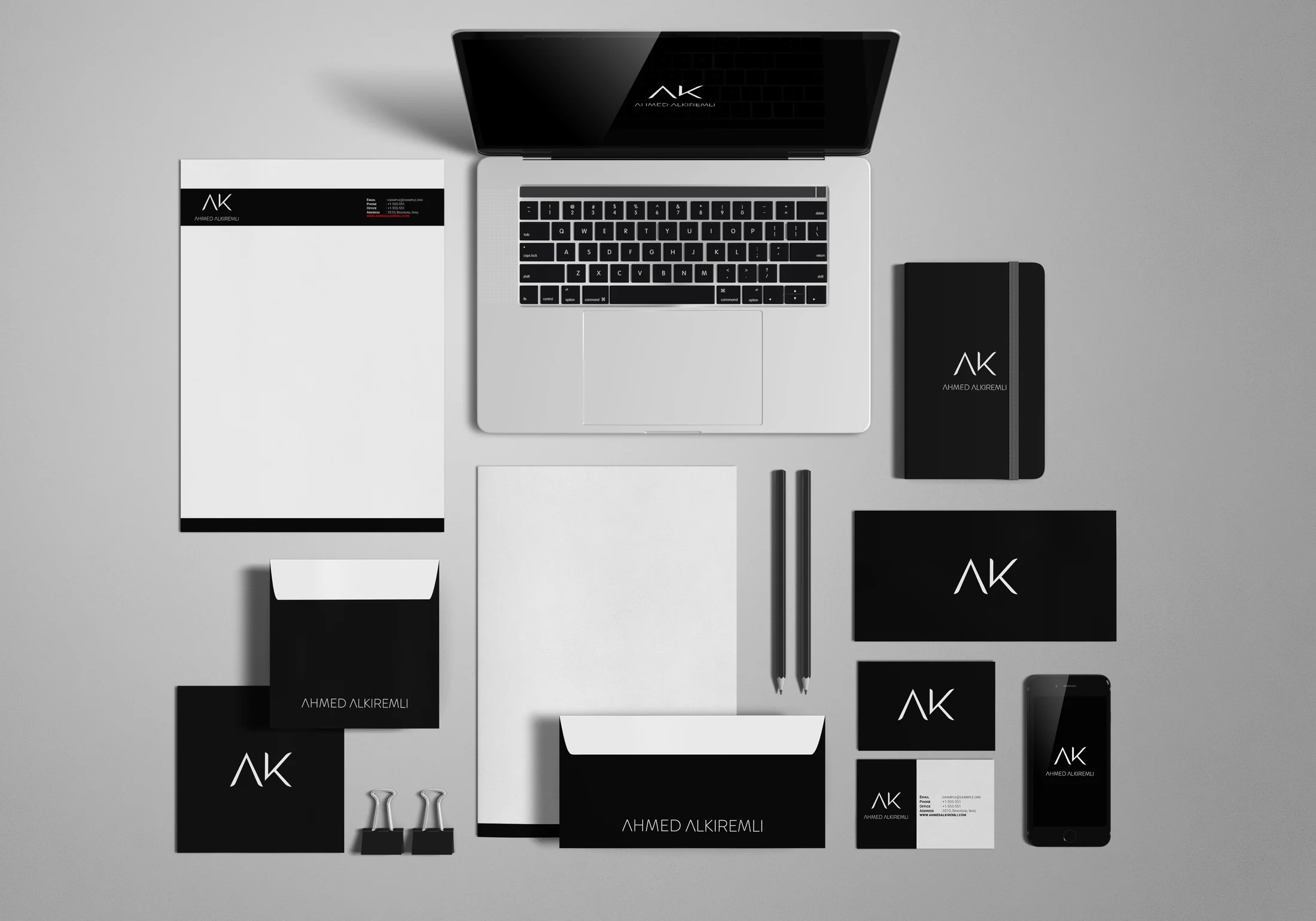
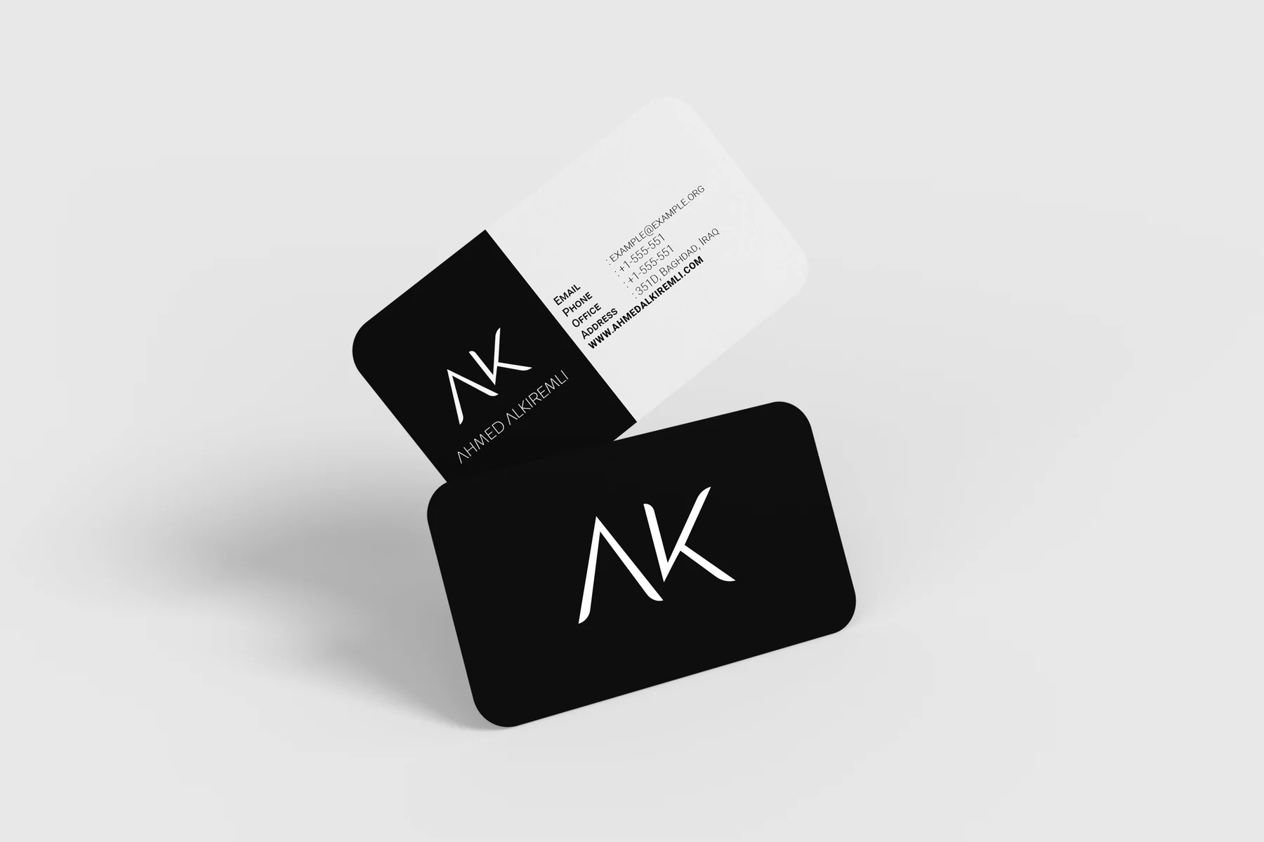
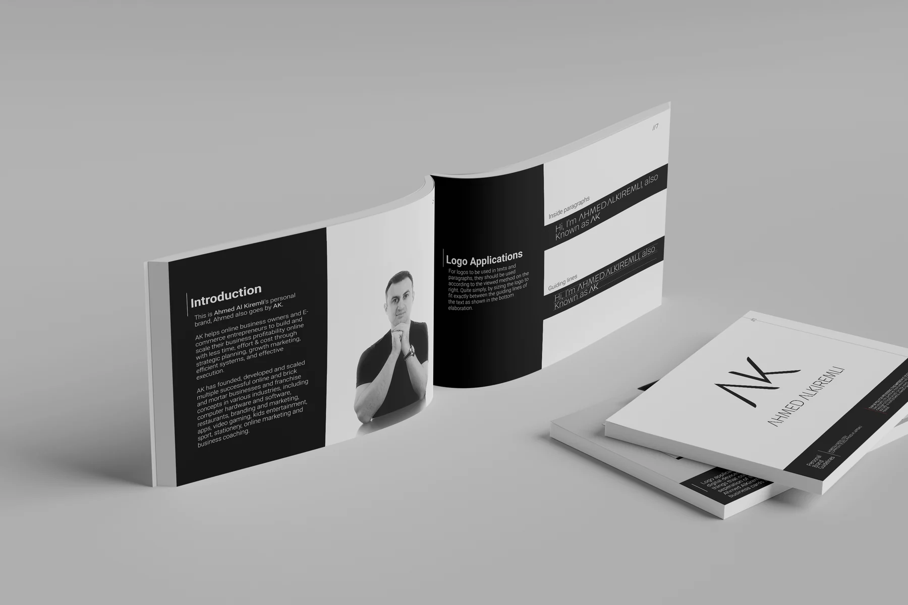
Stationery. Black and white only, nothing else.
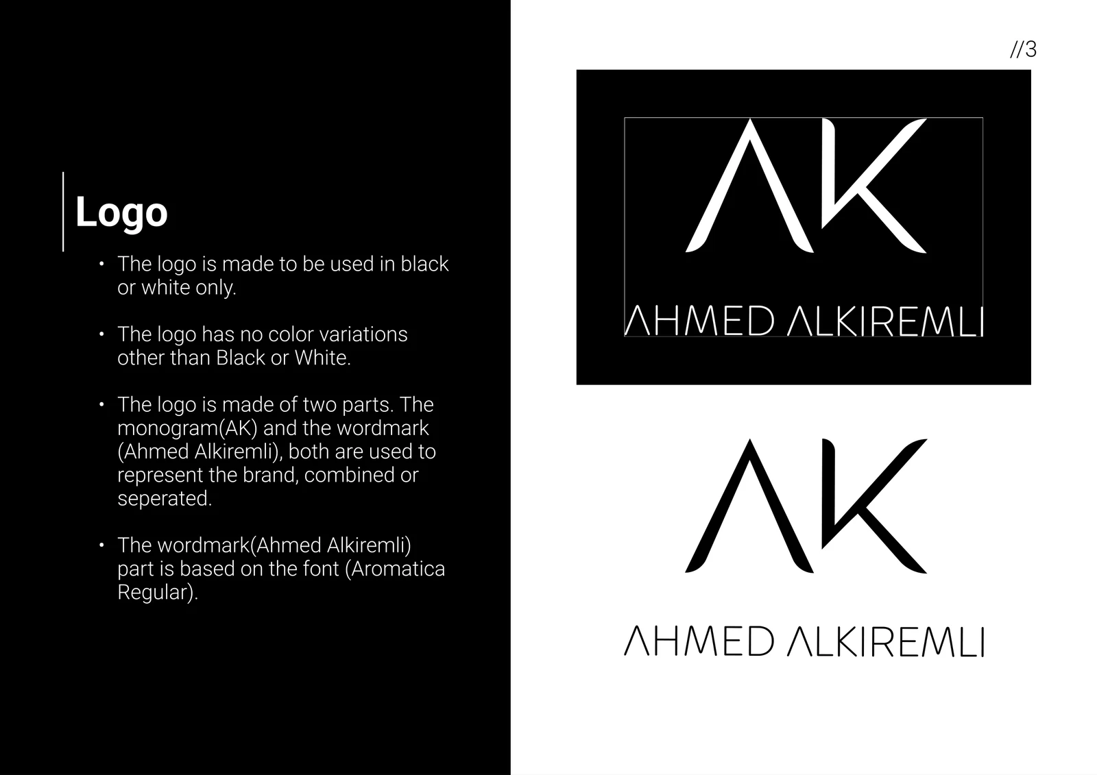
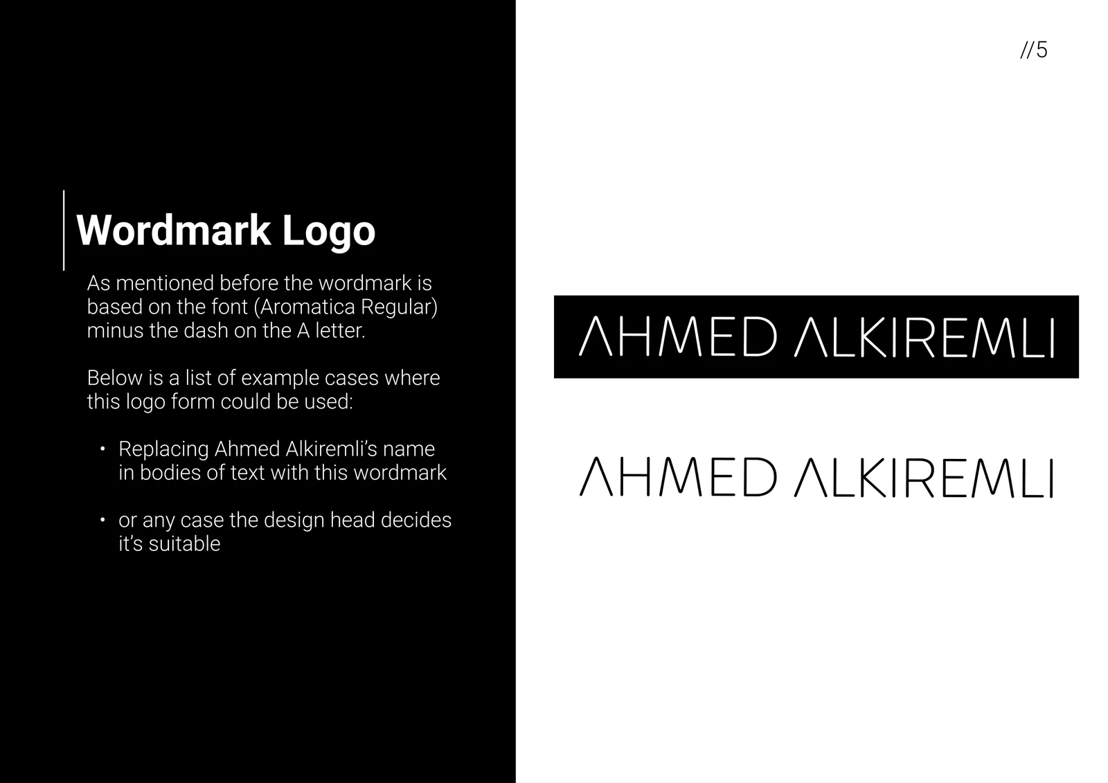
The rules. The A loses its bar in the monogram and the wordmark, so the two read as one family.
Clients





































About
Most of my work starts with a problem, not a brief. A brand that blends in, a launch with no time left, a product nobody gets yet. I find the real problem, then solve it with design.
Identity, motion, 3D and the web, all from the same pair of hands, so nothing gets lost between them. I work as a partner, not a vendor: in the room early, there until it ships.
aliakram.art@gmail.com